Chapter 1: Why Most Hotel Homepages Fail to Drive Bookings
Your hotel website looks beautiful. The photos are strong, the design feels polished, and at first glance it seems like everything is in place.
And yet it does not bring many direct bookings. It barely shows up on Google. AI tools like ChatGPT do not mention it. And guests who do land on it often leave without taking the next step.
That is frustrating, especially because the problem is usually not the quality of your hotel. And it is usually not a lack of effort either. The problem is often much simpler: your homepage looks good, but it does not create enough clarity.
Most hotel homepages are built to impress visually. But a homepage has a much more practical job to do. It should help people understand, within seconds, what kind of hotel this is, who it is right for, what makes it special, and where to go next.
Instead, many homepages raise more questions than they solve.
A guest lands on the page and starts looking for quick answers. Is this hotel right for me? What do the rooms look like? What does it cost roughly? Can I trust this place? What is nearby? What if I still have a question? If those answers are hard to find, people hesitate. And hesitation is where bookings start to disappear.
Google and AI tools face a similar problem. If your homepage is vague, overly generic, or built more like a glossy brochure than a clear guide, they struggle to understand what your hotel should be shown for. And if they do not understand it, they are far less likely to recommend it.
That is why this article is really about more than hotel homepage design. It is about hotel homepage structure. Because structure creates clarity. And clarity does a lot of heavy lifting: it helps discovery, builds trust, supports comparison, reduces uncertainty, and moves people closer to booking.
A homepage is not there to say everything. It is there to orient people quickly, surface the most important choices, and guide them deeper into your website with confidence.
In this article, I will show you how to structure a hotel homepage so it can get discovered on Google and AI, clearly communicate what kind of hotel you are, and guide visitors toward booking. We will look at the key homepage elements that matter most, why they matter, and how to arrange them in a way that feels intuitive for both guests and search engines.
In this guide
- Why Most Hotel Homepages Struggle (Even When They Look Great)
- The Clarity-First Homepage Framework: How to Turn Your Homepage Into a Booking Journey
- Deep Dive into How to Structure Each Element of Your Homepage
- Bonus: How to Set Up a Website
- Practical Examples — How Different Hotels Apply These Principles
- Quick Checklist — Is Your Homepage Actually Working?
- Connect This to Your Bigger Hotel Website Strategy
- FAQs on How to Structure a Hotel Homepage
Key Highlights in this article
Before we dive in, here’s why your hotel homepage matters more than you think.
✔ Most hotel homepages fail because they create uncertainty instead of clarity.
Guests don’t book when they still have questions.
✔ Clarity drives both bookings and visibility on Google and AI.
Search engines and tools like ChatGPT need clear structure to understand and recommend your hotel.
✔ In this article, you’ll learn a simple framework to structure your homepage.
From positioning and rooms to highlights, trust elements, and booking paths.
✔ You’ll get a practical checklist to improve your homepage step by step.
Rate your homepage like a guest, fix the weakest parts first, and iterate from there.
✔ The goal: turn your homepage into a clear, structured entry point that gets discovered and drives direct bookings.
Chapter 2: Why Most Hotel Homepages Struggle (Even When They Look Great)
If your homepage isn’t performing, it’s usually not because you did something wrong. It’s because the system you built it in was never really designed for how people search, compare, and book hotels online.
A few years ago, building a website was already a challenge on its own. You either had to learn tools like WordPress, Wix, or Squarespace, or rely on an agency to build it for you. And once it was live, it often stayed that way for a long time.
Most templates and agencies focus heavily on one thing: design. The result looks great. Clean layout, beautiful images, smooth animations. But what often gets overlooked is something much more important: how people actually use your homepage to make a decision.
Because a hotel homepage is not just a visual experience. It is part of a decision process.
When someone lands on your website, they are not browsing randomly. They arrive with a question in mind. Sometimes very clearly, sometimes just as a feeling:
- Is this hotel right for me?
- What makes it different from others nearby?
- What do the rooms look like?
- What does it cost roughly?
- Can I trust this place?
If your homepage doesn’t answer those questions quickly, people start searching for the answers themselves. They scroll, click around, open new tabs… and often leave.
That’s where most hotel websites lose bookings. Not because they lack quality, but because they create friction instead of clarity.
There is another layer to this that makes things even more difficult.
As a hotel owner, you usually don’t have access to large-scale data on how people behave across thousands of pages. You don’t see where exactly users drop off, what they compare, or what makes them convert. So it’s incredibly hard to judge what works and what doesn’t.
I’ve seen the other side of this.
When I was working at a large travel platform, we constantly ran experiments. We tested different layouts, different content structures, different ways of presenting rooms, prices, and trust elements. And we didn’t do it once. We did it over and over again, across thousands of pages, with real user behavior behind it.
That kind of data changes how you think.
You start to see patterns. You see what helps people move forward and what makes them hesitate. And one thing becomes very clear: the best-performing pages are not the most beautiful ones. They are the clearest ones.
That is exactly why I put this framework together.
Not because hotel owners need more design inspiration, but because they need a simple, practical structure that reflects how guests actually search, think, and decide.
In the next section, I’ll walk you through that structure step by step, so your homepage doesn’t just look good, but gets discovered, builds trust quickly, and guides visitors toward booking.
Chapter 3: The Clarity-First Hotel Homepage Framework: How to Turn Your Homepage Into a Booking Journey
If there’s one thing to take away from this article, it’s this:
A high-performing hotel homepage is not a collection of nice sections.
It is a guided decision journey.
Every element on your homepage should help answer one key question in your guest’s mind. Step by step. Without friction. Without confusion.That’s exactly what this framework is built for.
I call it the Clarity-First Hotel Homepage Framework. A simple, practical system to structure your homepage so it gets discovered on Google and AI, creates instant understanding, and guides visitors toward booking.
Instead of thinking in blocks like “gallery” or “room section,” think in moments of decision.
Because when someone lands on your homepage, they go through a very predictable mental flow:
- What is this hotel?
- Does it look right for me?
- Can I take action already?
- What rooms do they have and what do they cost?
- Can I trust this place?
- What else do they offer?
- Is there a good deal for me?
- Who are the people behind this?
- What if I still have a question?
If your homepage answers these questions clearly and in the right order, something powerful happens:
👉 People move forward naturally.
If it doesn’t, they hesitate. And hesitation is where bookings disappear.
So instead of designing your homepage top-down, you design it along this decision journey.
Here’s how that looks in practice:
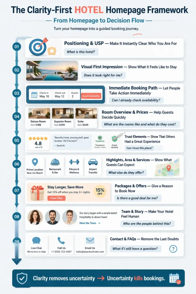
9 elements to Structure Your Hotel Homepage
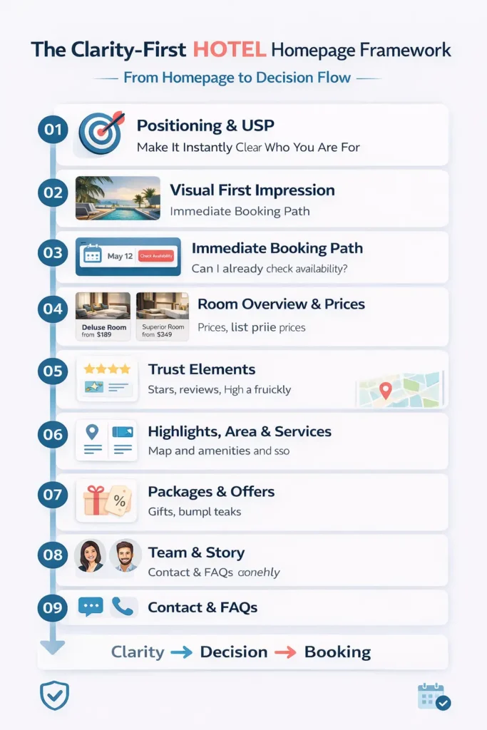
When analyzing hundreds of top-ranking hotel homepages, I identified 9 elements that top websites contained. I’ll introduce them to you in the logical order they should appear on your homepage. Smaller variations are of course fine.
1. Positioning & USP — Make It Instantly Clear Who You Are For
This is the most important part of your homepage.
Within seconds, visitors should understand what kind of hotel you are, who you are best suited for, and what makes you different. The key is specificity. Not “beautiful boutique hotel,” but something like “boutique hotel for couples in SoHo with a spa and rooftop terrace.”
Focus on your main audience, not everyone. If most of your guests are couples, speak to couples clearly. The clearer your positioning, the easier it is for guests, Google, and AI to match you with the right searches.
2. Visual First Impression — Show What It Feels Like to Stay
Before people read, they feel.
The top part of your homepage (often called “above the fold,” meaning what people see before scrolling) should give a quick, strong impression of your hotel. Use a small selection of high-quality images that show your rooms, atmosphere, and key highlights.
This is not about showing everything. It’s about helping guests quickly think: “Yes, this could be for me.”
3. Immediate Booking Path — Let People Take Action Without Searching
Some visitors are ready to take the next step immediately.
Your homepage should make this as easy as possible. Ideally, guests can select dates right away or jump directly into your room overview. If possible, make your booking button visible at all times (a sticky button).
Because once someone decides to check availability, every extra click or second of searching creates friction.
4. Room Overview & Prices — Help Guests Decide Quickly
At some point (usually very early), every guest wants clarity on one thing:
What are the rooms like, and what do they cost?
Your homepage should give a simple overview of your main room categories, including images, clear names, key features, and a starting price. This helps guests quickly understand if your hotel fits their needs and budget.
There is nothing more frustrating than clicking through multiple pages only to realize it’s not the right fit. Clarity here saves time and builds trust.
5. Trust Elements — Show That Others Had a Great Experience
Even if everything looks great, people still want reassurance.
Show real reviews, ratings, and external validation early on. This can include review scores (e.g. 4.7/5), written guest feedback, and links to platforms like Google or TripAdvisor.
You can also highlight awards, certificates, or mentions on trusted sites. The goal is simple: show that others trust you, so new guests can trust you too.
6. Hotel Highlights, Area & Services — Show What Guests Can Expect
Even if everything looks great, people still want reassurance.
Show real reviews, ratings, and external validation early on. This can include review scores (e.g. 4.7/5), written guest feedback, and links to platforms like Google or TripAdvisor.
You can also highlight awards, certificates, or mentions on trusted sites. The goal is simple: show that others trust you, so new guests can trust you too.
7. Packages & Offers — Give a Reason to Book Now
Sometimes guests just need a small push to move forward.
Packages and offers can do exactly that. This could be seasonal deals, bundled experiences, or targeted offers for your audience (e.g. family packages or romantic stays). For you, it’s a great opportunity to fill rooms, periods, and services that are usually more difficult to fill.
The key is that it should feel like real value, not just marketing. A good offer reduces hesitation and helps guests commit.
8. Team & Story — Make Your Hotel Feel Human
Hotels are not just rooms. They are experiences created by people.
Showing your team, your story, or what makes your hotel special behind the scenes builds connection and trust. This is especially powerful for smaller or independent hotels.
It helps guests feel: “I know who I’m booking with.”
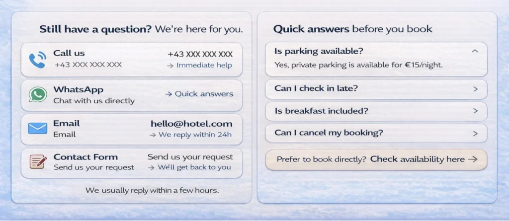
9. Contact & FAQs — Remove the Last Doubts
At the end of the journey, small questions can still block a booking.
Make it easy for guests to contact you: phone, email, or messaging (e.g. WhatsApp). Add a simple FAQ section with common questions like parking, check-in times, or cancellations.
The easier it is to clarify something, the more likely people are to book.
From a Homepage to a Decision Flow
If you step back, you’ll notice something:
This is not about adding more sections. It’s about removing uncertainty step by step.
Each element answers a specific question and helps guests move forward with confidence.
👉 Not because your homepage is more complex.
👉 But because it is more clear.
In the next section, we’ll go deeper into each of these elements and look at how to implement them in practice with concrete examples and details you can apply directly.
Chapter 4: Deep Dive into How to Structure Each Element of Your Homepage
Before we go into each element, there is one concept that is worth understanding first, because it affects several of the most important decisions on your homepage.
What “Above the Fold” Means on a Hotel Homepage
When someone lands on your homepage, they usually do not start by reading everything carefully.
They scan. They look around. They try to understand very quickly whether they are in the right place.
Everything they see before they scroll is called “above the fold.” In simple terms, it is the top part of your homepage that is visible immediately.
This area matters a lot because it shapes the first impression and often the first decision. If it is clear, visitors keep going. If it is vague, confusing, or too generic, they hesitate.
That is why some of your most important elements should already appear here. Your positioning should be visible. Your visuals should give a quick impression of the hotel. Your booking path should be easy to find. And ideally, even some early trust signals or hints of your room offer should already be visible.
Because before someone explores your website, they first need to feel one thing:
👉 Yes, I am in the right place.
How do you apply The 9 Elements on your Hotel Homepage?
Now let’s go through each homepage element in the same order I recommend showing them on your page. We’ll start with the ones that should already appear above the fold.
1. Positioning & USP — Make It Clear What Kind of Hotel You Are
This is where a lot of hotel homepages become too vague.
They say things like beautiful boutique hotel, elegant stay, or perfect place to relax. It sounds nice, but it doesn’t say enough. It does not tell people clearly who the hotel is for, what makes it different, or why it should be chosen over others nearby.
A strong positioning should make three things clear very quickly:
- who your hotel is best suited for
- where exactly it is
- what makes it special
So instead of saying boutique hotel in London, you might say something more specific like:
Boutique hotel for couples in SoHo with spa, pool, and sauna.
That does two things at once.
First, it helps guests. People searching for a romantic stay, a couples’ getaway, or a wellness-focused hotel can immediately see whether your hotel fits what they want.
Second, it helps SEO and AI discovery. The clearer you are about your audience, location, and features, the easier it becomes for Google and AI tools to understand what searches your hotel is relevant for. And the better they understand that, the better they can match your hotel with people searching for exactly those things.
That is why specificity is not a limitation. It is an advantage.
If 90% of your guests are couples and 10% are solo travelers, do not build your homepage around the 10%. Speak clearly to the majority. A focused position is usually much stronger than trying to appeal to everyone at once.
Your positioning should also not live in only one sentence. It should show up again across your homepage. In your title, in your visual choices, in your room selection, in your highlight sections, and even in your offers. If you are a family hotel, people should feel that throughout the page, not just read it once at the top.
The goal is simple: when someone lands on your homepage, they should not have to figure out what kind of hotel you are.
They should understand it within seconds.
2. Gallery with Highlights — Give a Quick Visual Impression
Once people understand what kind of hotel you are, they want to see whether it feels right.
This is where your visual first impression matters. The images near the top of your homepage should not try to show every corner of the property. Their job is much simpler: give people a quick sense of the atmosphere, style, and standout features of your hotel.
Think of it as a visual overview, not a full tour.
If your hotel is known for a beautiful spa, show it. If your rooms have amazing views, show that. If you are a family hotel, show spaces that actually make families feel welcome. The visuals should support your positioning, not compete with it.
This is one of the most common mistakes on hotel homepages: the images are beautiful, but they could belong to almost any hotel. They create mood, but not clarity.
Your images should help people think:
👉 Yes, this is the kind of stay I was hoping for.
3. CTA, Date Selection & Contact — Make the Next Step Obvious
At this point, some people are already ready to move forward.
They may want to check availability, compare rooms, or simply see whether the dates and rates work for them. That is why your homepage should make the next step extremely easy.
Ideally, there is already a clear booking entry point above the fold. This could be a date selector, a Check Availability button, or at least a very visible path to the room overview page. If possible, I recommend making the booking button sticky, so it remains visible while people scroll.
Why does this matter so much?
Because once someone decides to take action, even small friction becomes dangerous. If they need to search for the booking button, scroll back up, or guess where to click next, you create an unnecessary chance for hesitation.
And hesitation is rarely your friend on a hotel website.
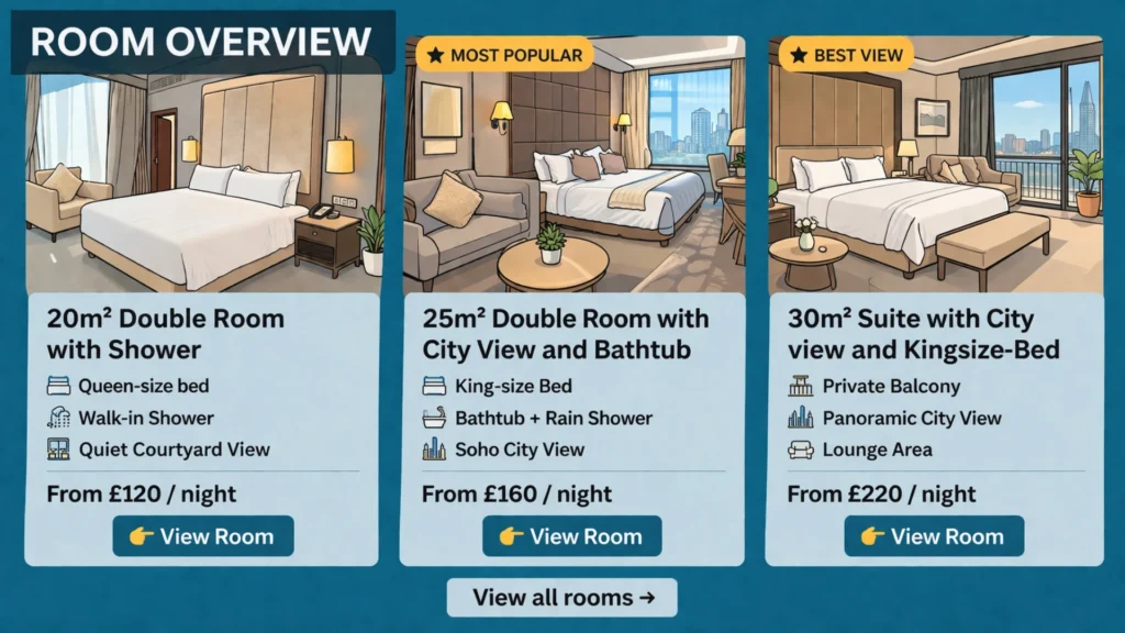
4. Room Overview & Prices — Help Guests Decide Faster
This is one of the most important sections on your homepage.
Because at this point, the decision becomes real. People don’t just want to understand your hotel anymore. They want to understand what they would actually book.
- What rooms do you have?
- What do they look like?
- What’s the difference between them?
- And what do they roughly cost?
If your homepage doesn’t answer those questions early, people start clicking around, searching, comparing… and often get frustrated. There is nothing more annoying than going through multiple pages, only to realise in the end that the room doesn’t fit or the price is not what you expected.
That’s why your room overview should appear relatively high on the homepage. Ideally, parts of it are already visible or easily reachable without much scrolling.
Show your main room categories, either sorted by popularity (best option) or by price. If you have many categories, focus on the most relevant ones and link to a full overview.
For each room, give a quick but clear impression:
- 1–3 strong images (room, bathroom, view)
- a title that clearly differentiates the room based on guest-relevant features (not internal names), e.g. “Double Room with Balcony & Mountain View” vs. “Standard Room”
- a “from” price
- a few key facts (bed type, size, view, balcony, bathtub/shower, …)
The title is especially important. It should immediately answer:
👉 Why should I choose this room over the others?
Avoid internal or vague names like:
- Standard Room
- Comfort Room
- Deluxe Room
Instead, describe what actually matters to the guest:
- Double vs. Twin beds
- Balcony or not
- View (garden, city, mountain, sea)
- Size or layout
- Special features (bathtub, terrace, workspace, …)
This does two things:
- Guests can compare rooms instantly without clicking into each one
- Search engines and AI can better understand and match your rooms to specific searches
The goal of the room overview is simple:
Within a few seconds, guests should understand what they can book and whether it fits their expectations and budget.
If they can answer that quickly, they move forward. If they can’t, they hesitate. And hesitation is where bookings get lost.
5. Trust Elements — Let Others Confirm Your Quality
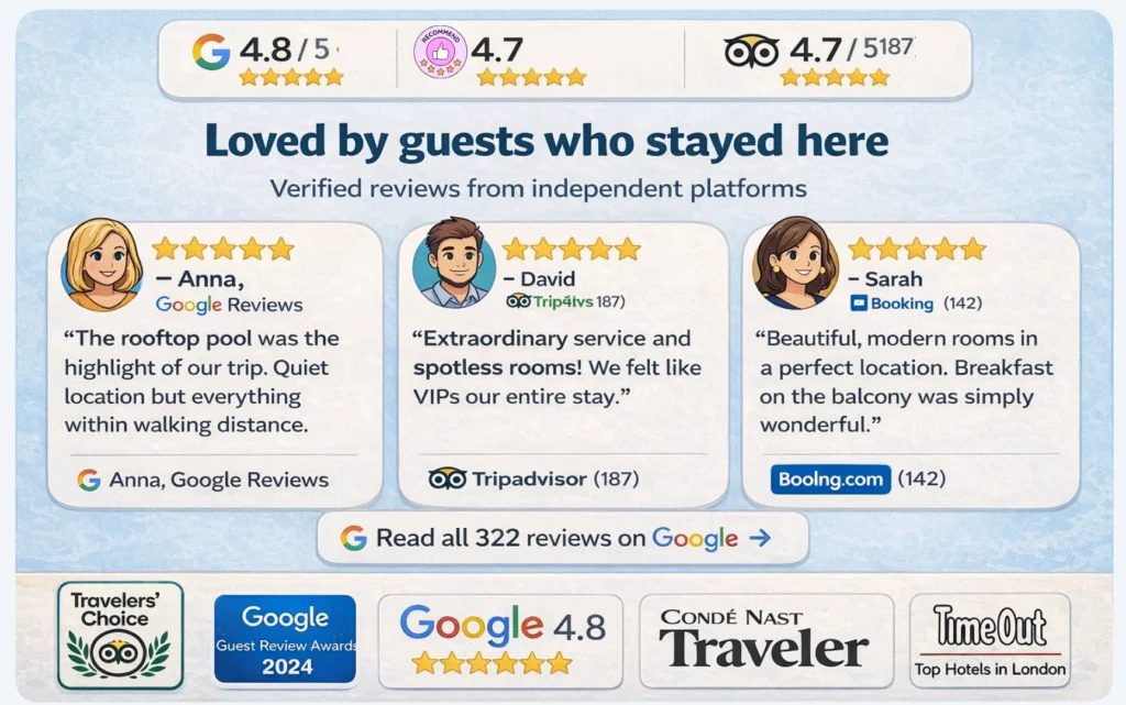
At this stage, people start asking a different question:
👉 Can I trust this place?
And the answer should not come from you alone. Strong hotel websites combine two types of trust.
Fast trust helps people build confidence instantly:
- your rating (e.g. 4.7 / 5)
- the number of reviews
- recognizable platforms (Google, TripAdvisor, Booking.com)
- award or certificate icons
These elements work quickly because people already know them. They don’t need to think. They just recognize and trust. That’s why some of them should already appear above the fold. But fast trust alone is not enough.
Deep trust builds real conviction:
- written guest reviews that describe the experience
- links to external platforms where reviews are collected
- mentions on trusted sites or in media
- certificates that reflect quality or standards
Here are some practical examples you can use:
- Google Reviews, TripAdvisor, Booking.com ratings
- Travelers’ Choice awards
- mentions in Condé Nast Traveler or similar publications
- Michelin Guide listings (if relevant)
- local tourism board memberships
- sustainability or accessibility certifications
The key detail is this: Whenever possible, link to the external source.
Because it changes how people perceive your website. Instead of thinking:
“They probably selected the best reviews or wrote them themselves.”
They think:
“These are real reviews from real guests.”
That small shift builds a lot of trust. The goal of this section is not to say that your hotel is great.
It is to show that others have already experienced it and confirm it.
6. Highlights of the Hotel — Show What Guests Can Experience
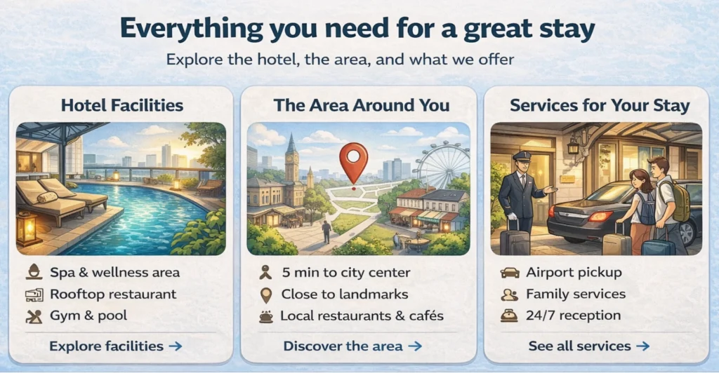
This section is your opportunity to show the main highlights of your hotel.
After understanding your rooms and prices, guests naturally look for a broader picture. They want to see what else your hotel offers and what their stay would actually feel like.
The goal here is not to show everything.
It is to give a clear and structured overview of what matters most.
A helpful way to organise this section is into three areas:
Facilities
What guests can use inside the hotel: restaurant, breakfast, spa, pool, gym, common areas, …
Location and surroundings
What is nearby and why it matters: public transport, sights, beaches, nature, activities, …
Services
What support or extras guests get: airport transfer, childcare, guided tours, special arrangements, …
For each element, give a short description, a strong image, and a link to a dedicated page with more details.
But structure alone is not enough. What really makes this section work is what you choose to show.
Instead of listing standard features, focus on what makes your hotel stand out and what guests actually care about.
That can be something larger:
– a wellness area with treatments included,
– a rooftop terrace,
– a setup that makes traveling with kids genuinely easy.
Or something small but meaningful:
– a daily tea tradition,
– a personal welcome,
– a detail that makes guests feel taken care of.
These are often the things that stay in people’s minds. And in many cases, they are what tip the decision when someone is still unsure.
7. Packages & Offers — Make It Easier to Say Yes
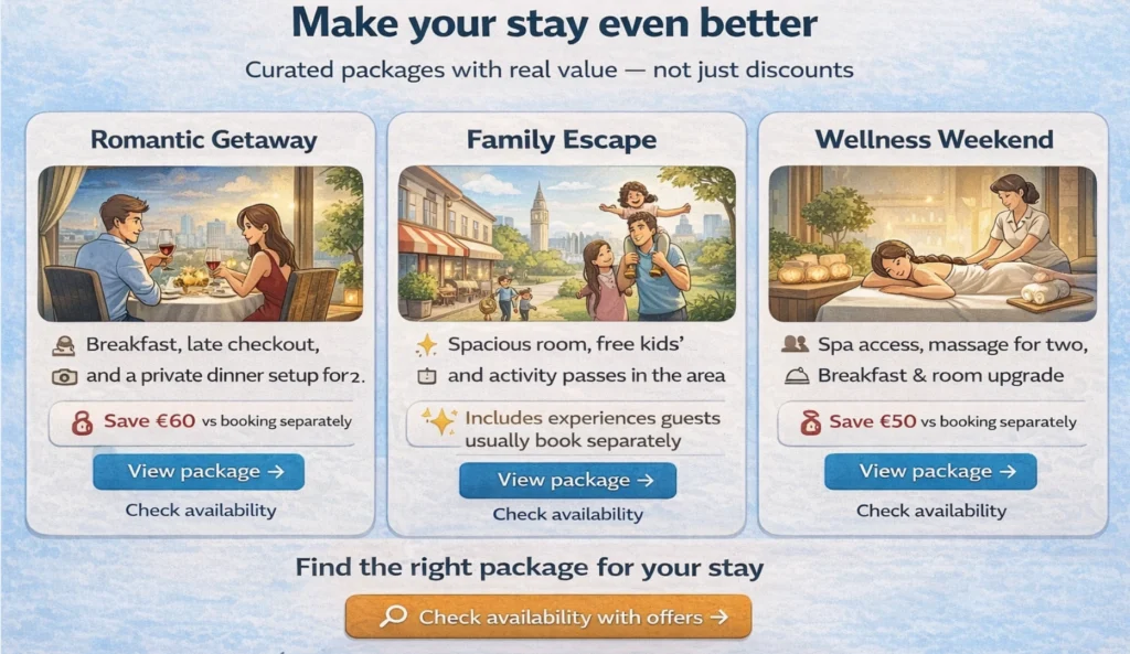
At this stage, guests often have enough information to decide. And yet, some still hesitate. Not because something is missing, but because they are not fully convinced to act now. This is where packages and offers can help.
But they should be used carefully. Not every hotel needs them. And they should never feel like random discounts on the homepage. Used well, they support your overall positioning.
For example, they can:
- match your target audience (e.g. couples, families, wellness guests)
- help fill less popular periods
- increase booking value through bundled experiences
- combine things guests would book anyway into one clear offer
The key is how they are put together.
A good package does not feel like a promotion. It feels like something that was created with thought and care.
Something where the guest feels:
- this was made for me
- this is a great opportunity
- or this makes my stay easier and more complete
For example:
– a romantic weekend that already includes dinner and spa access,
– a family stay with activities prepared,
– or a seasonal offer that gives access to your hotel at a particularly good value.
In those moments, the decision becomes easier. Not because the price is lower. But because the offer feels right.
And that is exactly what this section should do:
Help guests move from “this looks good” to “I want to book this.”
8. Team & Story — Build a Personal Connection (When It Matters)
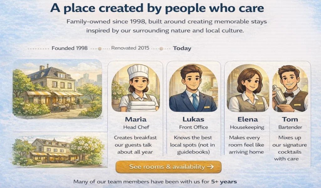
At this point, most of the rational questions are already answered.
Guests understand your rooms, your pricing, your location, and what you offer. Now there is one final layer that can make a difference: how it feels to stay with you.
This is where your team and your story come in.
For many hotels, especially independent, boutique, or family-run ones, this can be a strong trust element. It gives your hotel a human side and helps guests feel that they are not just booking a place, but arriving somewhere where people care.
You can show:
- who you are as owners or hosts
- what your hotel stands for
- who the people are behind the experience
It does not need to be long or overly emotional. A few authentic sentences, a real photo, and a clear tone are often enough to create connection.
At the same time, this section is not equally important for every hotel. If your hotel is highly transactional, focused on price, or located near an airport, guests may care less about the story and more about speed and clarity.
But if your experience is part of what makes your hotel special, this section can reinforce everything you showed before.
It turns a good option into a place people feel comfortable choosing.
9. Contact & FAQ — Remove the Last Doubts
Even with a clear homepage, some questions will remain. And that is completely normal.
The difference is how easy it is for guests to get those answers.
At this stage, your goal is simple: remove the final uncertainty and make it easy to take action.
That starts with clear and accessible contact options.
Keep it simple, but complete:
- a phone number to call
- a messaging option (e.g. WhatsApp)
- an email address
- a contact form
What matters most is not the number of options, but the feeling behind them.
Guests should feel that they can reach a real person easily. That someone is there to help. That they are not left alone with their questions. This is where you can even outperform large booking platforms.
They may offer 24/7 support, but you offer something more valuable:
direct, personal contact with the hotel itself.
In addition, a short FAQ section can remove common friction points before they even arise.
Look at what guests regularly ask: parking, check-in times, cancellations, children, pets, accessibility, …
Answer those questions clearly and directly. Because in the end, bookings are often not lost because of big issues. They are lost because of small, unanswered questions. And this section is where you make sure none of them get in the way.
A Homepage That Guides, Not Just Shows
If you step back and look at all these elements together, one thing becomes clear: A strong homepage is not a collection of sections. It is a guided path through a decision.
Each part has a very specific role.
- Your positioning helps people understand what kind of hotel you are.
- Your visuals create a first impression.
- Your rooms and prices help them assess if it fits.
- Your trust elements remove doubt.
- Your highlights and offers reinforce the value.
- Your story builds connection.
- And your contact options remove the final friction.
When these pieces work together, something important happens. Guests don’t need to search anymore. They don’t hesitate. They move forward. And that is exactly the goal.
So one key element I want to mention at this stage, and it is akey message if you want to get more bookings:
Have a booking option always present in the view of the user.
Best is if you have a sticky booking button that follows you when scrolling. Second best is to have several options across the page, where you link to your page, where people can select and book their preferred room.
Combining all this, you don’t just have a homepage that looks good. But a homepage that helps people understand, feel confident, and book.
Bonus: How to Set Up a Website for your Hotel
A lot of hotel owners think the hard part is getting a website online.
In reality, the harder part starts after that.
Because a website that brings bookings is rarely finished. It improves over time. You collect feedback, notice what guests ask, see where people hesitate, and then make small updates that make the page clearer and more useful.
That is why I strongly recommend having a website you can actually manage yourself.
If every little update means calling an agency, waiting for changes, and paying for small adjustments, most improvements simply won’t happen. And over time, that becomes a real disadvantage.
If you do not have the time to manage it yourself, give that responsibility to someone in your team. In many hotels, there are quieter moments during the day, especially at reception, where small website updates are realistic. And sometimes, the right person in your team is happy to take ownership of exactly this kind of work.
As for the setup itself, a website builder is usually the most practical option. My personal recommendation is WordPress, mainly because it is flexible, widely used, and there are many templates and plugins that can support the structure described in this article. It is also relatively easy to find someone who can help with the first setup and then show you how to manage it afterward.
AI website builders may become a very good option too. I think that space will move quickly. For now, I would mainly focus on one thing: whatever system you choose, make sure it allows you to update and improve your homepage without too much friction.
Because in the end, the best hotel website is not the one that looked perfect on launch day. It is the one that gets better over time.
Chapter 5: Practical Examples — How Different Hotels Apply These Principles
At this point, the framework should feel clear. But seeing how real hotels apply (or don’t apply) these ideas makes it much easier to understand what actually works. The following examples show different approaches to homepage structure. Each one does some things very well and leaves room for improvement in others.
Example 1: Z Hotel Soho — Clear Positioning and Strong Booking Flow
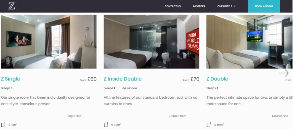
Website: https://www.thezhotels.com/hotels/soho/
What they do well
They don’t follow my above the fold recommendations, but the website has a clean and clear structure. Z Hotel Soho has a very clear positioning: a clean, modern hotel at a reasonable price. That clarity shows up throughout the homepage. The pricing is visible early, the offer is easy to understand, and there is always a clear path to booking. No matter where you are on the page, you can move forward.
It is also not surprising that they show up well for searches like budget hotels in London. Their positioning is specific enough for Google and AI to understand and match.
What I would improve
The top section could be stronger. The positioning could be clearer at first glance, supported by sharper visuals and more explicit trust elements. Right now, it works, but it could work faster.
Main lesson
Clarity in positioning and a strong booking path matter more than design perfection.
If people immediately understand what you offer and can act on it, the homepage works.
Example 2: One Aldwych — Strong Audience Targeting
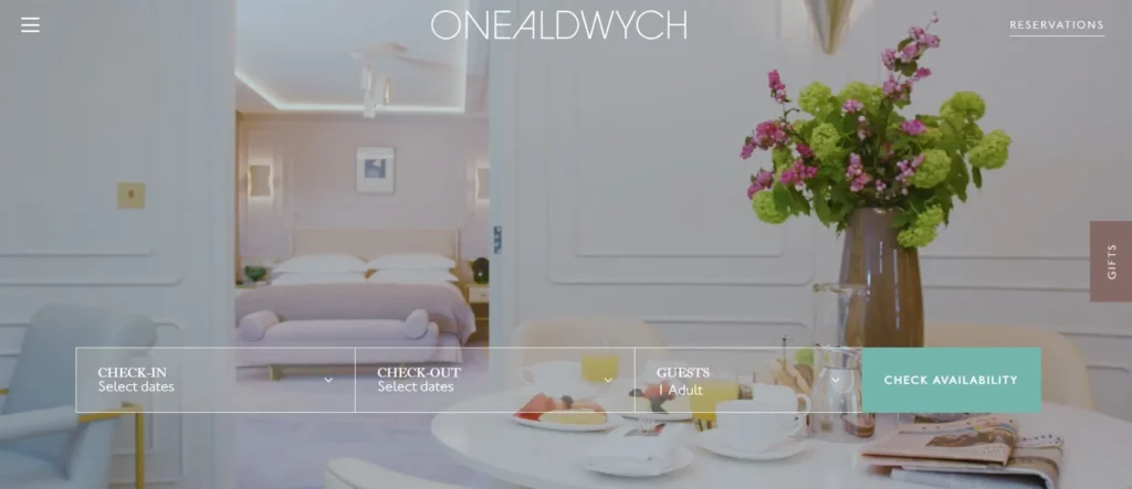
Website: https://www.onealdwych.com/
What they do well
One Aldwych is a great example of audience-specific targeting. They showed up when I searched for family hotels in Covent Garden, and that positioning really shines through. You can see it in their offers, especially the dedicated kids experience.
What is interesting is that they don’t rely only on the homepage. They also have dedicated pages targeting specific audiences, which is a very smart approach if your hotel serves multiple segments. The way they present the location, surroundings, and the overall experience is also very strong.
What I would improve
I’d personally add room rates as well as some trust elements, but I found the overall design of the homepage very convincing. Making pricing and trust more visible earlier would help guests make faster decisions.
Main lesson
You don’t have to be everything on one page. You can target specific audiences through dedicated pages — but the homepage should still guide people clearly toward the right path.
Example 3: Mandarin Oriental — Structured Overview of a Premium Offering
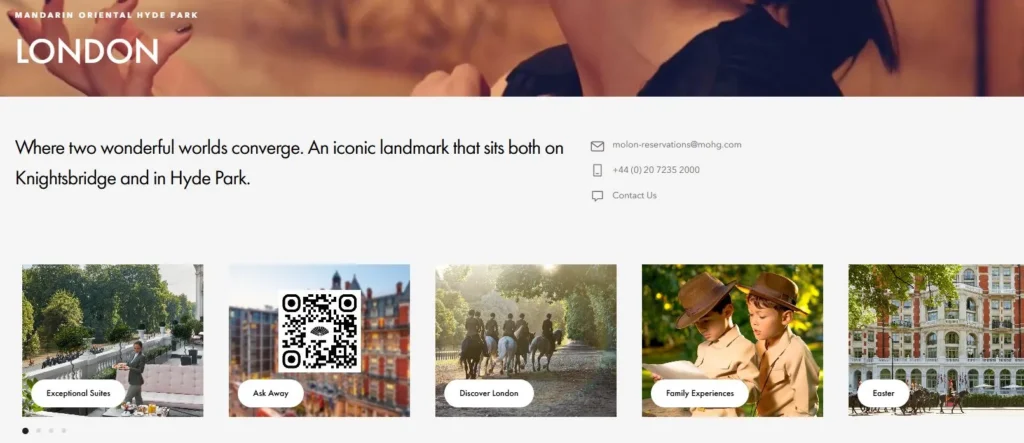
Website: https://www.mandarinoriental.com/en/london/hyde-park
What they do well
What would be a blog article from me without mentioning the Mandarin Oriental. I wonder when they ask me to either stop or treat me with a nice stay at their hotel. Anyway, I’m such a fanboy, because the structure of the website is so clean. You get an overview very quickly and they really show their broad offering.
Everything feels organized and easy to navigate, even though the hotel has a wide range of experiences. I also like how trust elements are woven into the content. Mentions like Michelin stars are not overly pushed, but still clearly communicated.
What I would improve
The descriptions are sometimes a bit too flowery. They sound beautiful, but they don’t always help guests understand concrete details quickly. A bit more clarity would make the decision process even smoother.
Main lesson
Even in luxury, clarity wins. You can keep a premium tone, but guests still need to understand quickly what they get.
Example 4: Covent Garden Hotel — Homepage as a Navigation Hub
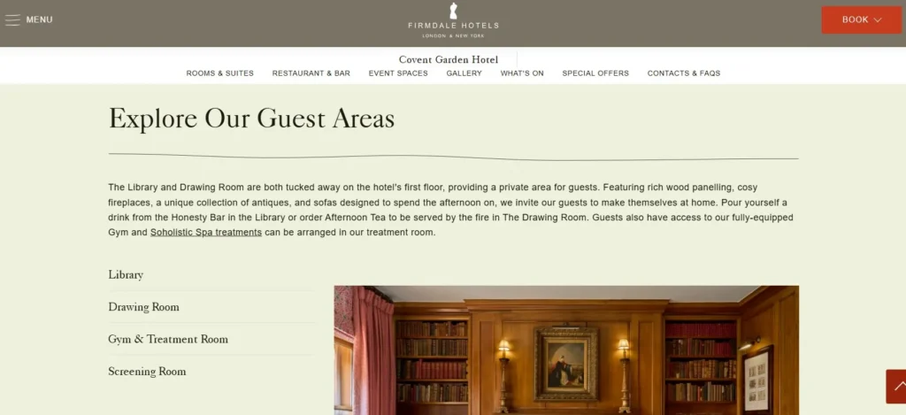
Website: https://www.firmdalehotels.com/hotels/covent-garden-hotel
What they do well
This is a good example of a homepage that mainly acts as navigation. It is very easy to scroll, explore, and jump into different sections like rooms or the restaurant. Especially on mobile, this works very well, which is important because most guests search on their phones.It gives a quick overview and lets users decide where to go next.
What I would improve
I again miss a bit of the key facts like prices or reviews.Right now, users need to click deeper to get important information that could already help them decide.
Main lesson
A homepage can act as a navigation layer.But it should still answer the most important questions early, so users don’t have to search for basic information.
What You Should Take From These Examples
Across all examples, one pattern stands out:
The best homepages are not the most impressive ones.
They are the ones that make it easiest to understand, compare, and decide.
And that is exactly what your homepage should aim to do.
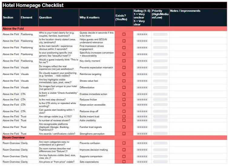
Chapter 6: Checklist — Is Your Hotel Homepage Actually Working?
At this point, you’ve seen the structure. Now the question is:
Does your homepage actually follow it?
Here is a simple way to find out.
For each key section of your homepage, ask yourself two things:
- Does this section exist?
- How well does it answer a guest’s questions? (Rate 1–5)
- 1 = Very unclear / missing key information
- 3 = Decent, but could be improved
- 5 = Very clear, no hesitation
Just go through each section, rate it, and you’ll instantly see where you’re losing potential bookings.
How to use this checklist
Start at the top of your homepage and go section by section.
Then:
- Fix all 1s and 2s first
- Work from top to bottom (this matters more than you think)
- Then improve the 3s
- Repeat until your homepage feels effortless to understand
Because that’s the goal:
A guest lands on your page and immediately thinks
“This looks right. I understand it. Let’s check availability.”
The key sections to review
Here is the simplified version of the framework from Chapter 4:
- Above the fold (first impression)
- Who is your hotel for?
- What makes it special?
- Can guests take the next step immediately?
- Are there some trust elements (e.g. ratings, certificates)?
- Room overview (clarity of offer)
- Can guests understand the room options easily?
- Is it obvious what they can book?
- Social proof (trust)
- Do you show reviews or ratings clearly?
- Do guests feel reassured quickly?
- Hotel highlights (why choose you)
- Are your key features clearly explained?
- Can guests quickly see what makes you different?
- Practical information (remove uncertainty)
- Location, parking, breakfast, check-in, etc.
- Are common questions answered without searching?
- Team / story (connection)
- Do guests get a feel for the people behind the hotel?
- Does it build trust and personality?
- Contact & FAQ (last doubts)
- Can guests easily reach you?
- Are typical questions answered upfront?
A small tip that makes a big difference
Be honest when you rate your homepage.
Don’t rate it as the hotel owner. Rate it like a guest who sees your hotel for the first time.
That difference alone often reveals most of the problems.
Download the Hotel Homepage Checklist
Download the checklist and go through your homepage step by step. If anything feels unclear or you want a second opinion, just reach out via the contact button at the end of the article.
Chapter 7: Connect This to Your Bigger Hotel Website Strategy
At this point, it helps to step back for a moment. Because your homepage is not just one page on your website. And it is definitely not just a pretty introduction to your hotel.
It plays a much bigger role than that.
A lot of hotel websites treat the homepage like a branding block. A nice hero image, a few polished sentences, maybe some highlights, and that’s it. But when you look at how people actually search, compare, and decide, the homepage has a much more practical role to play.
- It is a discovery page.
- It is a conversion support page.
- And it is a structural hub for your website.
That is why this topic matters so much.
Your homepage is a discovery page
If your positioning is clear, your homepage can help your hotel get discovered on Google and in AI tools like ChatGPT.
Let’s take the example from earlier: A boutique hotel for couples in SoHo with a wellness area, pool, spa, and sauna.
If that is clearly communicated on your homepage, search engines and AI tools have something concrete to work with. They can better understand:
- what kind of hotel you are
- who you are suited for
- which features you offer
- and where you are located
And that makes it much easier to match your hotel with specific searches. Not only with the exact full phrase, but also with parts of it:
- boutique hotel SoHo
- hotel with spa SoHo
- hotel for couples New York
That is one of the biggest advantages of a clear homepage structure.
It does not just help guests understand your hotel faster. It also helps search systems understand when to show it.
Your homepage is a conversion support page
Most guests will not complete the booking directly on the homepage. But that does not make the homepage less important for bookings. Quite the opposite. Its job is to help people quickly understand whether your hotel fits what they are looking for. It reduces uncertainty, creates trust, and gives them a clear path to the next step.
That might be:
- a room page
- an offer page
- the booking engine
- a contact option
So even if the homepage is not where the final booking happens, it plays a major role in whether people move forward at all.
In that sense, it is not the booking page. But it is often the page that decides whether a booking becomes more likely or less likely.
Your homepage is a structural hub
There is one more important role your homepage plays. It shows both users and search systems how your website is organised.
It signals:
- what matters most
- which pages are most important
- what guests should look at next
That is why the homepage should not stand alone. It should connect clearly to your room pages, your highlight pages, your offers, your contact options, and the rest of your most important content. In other words, your homepage is not just there to exist by itself. It is there to help the rest of your website work better.
And this is where a lot of hotels miss the bigger picture.
Homepage, room pages, highlights, internal links, offers, trust signals, … they do not work separately. They work together.
The clearer the structure, the easier it is for:
- guests to navigate
- Google to understand your site
- AI tools to recommend your hotel
Why your Hotel Homepage matters
If you get this right, your homepage becomes much more than a nice welcome page. It becomes:
- your hotel’s first impression
- your discovery asset
- your decision support page
- and your structural entry point into the rest of the website
That is why I would never think of the homepage as “just the homepage.” It is one of the key pages that helps your hotel get found online and generate direct bookings. Or said more simply:
Your homepage is not just there to look good. It is there to make the rest of your website work.
Chapter 8: Further Reading to get more bookings through Hotel Websites
If you want to go deeper into the topics behind this homepage framework, I’ve written separate guides on the most important parts:
- How to structure your hotel website
https://patricklindbichler.com/hotel-website-structure/ - How to write hotel room descriptions that help people book
https://patricklindbichler.com/hotel-room-descriptions/ - How guests actually search for hotels online
https://patricklindbichler.com/hotel-search-terms-seo/ - How to improve SEO and get more direct bookings for your hotel
https://patricklindbichler.com/hotel-seo-how-hotels-get-more-direct-bookings-from-google-chatgpt/
Together, these articles give you a clearer picture of how homepage structure, room pages, search behavior, and SEO work together.
Because in the end, a high-performing hotel website is not built through one perfect page.
It is built through a system of pages that are clear, useful, and connected.
Conclusion: A Homepage Should Reduce Uncertainty Fast
If you take a step back, everything in this article comes down to one simple idea:
Your homepage should make it easy for guests to understand your hotel and move forward with confidence.
Most hotel homepages do not fail because they look bad. They fail because they leave too many questions unanswered.
- What kind of hotel is this?
- Is it right for me?
- What do the rooms look like?
- What does it cost roughly?
- Can I trust this place?
If those answers are hard to find, guests hesitate. And if your homepage is vague, Google and AI hesitate too.
That is why this article is not really about hotel homepage design. It is about hotel homepage structure.
A strong homepage helps your hotel get discovered on Google and AI, quickly explains what kind of hotel you are, and guides visitors toward booking. And to do that, it does not need to say everything.
A homepage is not for completeness. It is for orientation.
It should help people understand where they are, what matters most, and where to go next. The hotel websites that perform best are not the ones that looked perfect on launch day. They are the ones that get clearer over time.
So now it is your turn.
- Go through your homepage today with the checklist.
- Check if each key section exists.
- Rate it honestly from a guest’s perspective.
- Start fixing the weakest parts, from top to bottom.
That is where better rankings and more direct bookings begin.
FAQs on How to Structure a Hotel Homepage
1. What should a hotel homepage include to increase direct bookings?
A high-performing hotel homepage should quickly answer the most important guest questions:
What kind of hotel is this? Who is it for? What do the rooms look like? What does it cost roughly? Can I trust it?
Key elements include:
- Clear positioning (who your hotel is for)
- Room overview with images and prices
- Trust elements (reviews, ratings, awards)
- Highlights (facilities, location, services)
- Clear booking paths (links to room and booking pages)
The goal is not to show everything, but to guide guests clearly toward a booking decision.
2. How do I structure a hotel homepage for SEO and AI tools like ChatGPT?
To rank on Google and be recommended by AI tools, your homepage needs clear structure and specific information.
Focus on:
- Clear positioning using real search terms (e.g. “boutique hotel for couples in Vienna”)
- Structured sections (rooms, highlights, trust, booking)
- Internal links to detailed pages (rooms, amenities, location)
- Content that directly answers real user questions
Search engines and AI don’t reward design. They reward clarity.
3. Why do most hotel websites not convert visitors into bookings?
Most hotel websites fail because they create friction instead of clarity.
Common problems:
- No clear positioning
- Missing room details or prices
- Weak trust signals
- Too much focus on design, not decision-making
When guests have to search for answers, they hesitate. And hesitation is where bookings are lost.
4. Should I show room prices on my hotel homepage?
Yes, in most cases you should show at least a “from price.”
Why:
- It helps guests quickly understand if your hotel fits their budget
- It reduces unnecessary clicks and frustration
- It filters for high-intent visitors
Many users actively search for “hotel + price” or ask AI tools about costs. If you don’t show it, you lose that demand.
5. What are the most important sections of a hotel homepage?
The most important sections are:
- Above the fold (positioning + first impression)
- Room overview (what guests actually book)
- Trust elements (reviews, ratings, credibility)
- Highlights (what makes your hotel special)
- Clear booking paths
If these are strong, the rest becomes much easier.
6. How can I improve my hotel homepage step by step?
Use a simple checklist approach:
- Check if each key section exists
- Rate each section from 1–5 from a guest perspective
- Fix all 1s and 2s first (top to bottom)
- Then improve the 3s
Repeat this regularly. The best websites are not built once. They are continuously improved.
7. Is the homepage where guests usually book?
Not usually.
The homepage helps guests:
- understand your hotel
- build trust
- compare options
Most bookings happen on:
- room detail pages
- booking engine pages
Your homepage’s job is to guide people there with clarity and confidence.
8. How important are internal links on a hotel website?
Very important.
Internal links:
- help guests navigate your website easily
- guide them toward booking pages
- help Google and AI understand your structure
A well-structured homepage acts as a central hub that connects all important pages.
9. Do I need special offers or packages on my homepage?
Not always.
Packages are useful if they:
- match your positioning
- help fill low-demand periods
- increase average booking value
- bundle something guests already want
For premium hotels, they should feel curated and thoughtful, not like discounts.
10. What is the main goal of a hotel homepage?
The main goal is not completeness. It is orientation.
A great homepage:
- reduces uncertainty quickly
- shows what matters most
- helps guests decide if your hotel is right for them
- guides them to the next step
Clarity is what drives both visibility and bookings.
The Prompt used To Create this article
I want to be transparent on how this article was written, so below you will find the prompt to create this article. Of course, I asked for adjustments afterwards, but here is the initial input:
Check the prompt
Can you create a compelling blog article for my website, www.patricklindbichler.com? I will first give you a full outline of my draft for the article, so you have the full context. Then we will create each section together step-by-step. So, no need to start writing, just give me feedback on the ideas of the draft and where you would see good additions or improvements.
I want to make the articles a bit longer, so people can find clear information. The article should be clear and easy to understand, especially for people who are new to the topic. Still it should stay as compelling as the original article and also have the same length. It should be written in good American English, using not too complicated words so that even non-native English speakers can follow along easily. The tone should reflect my expertise as a thought leader in SEO, content creation, and leadership. Feel free to use examples from my experience as proof points and explain them in a clear and compelling way.
I am typically a positive and humorous person, so the writing style can be upbeat with a few lighthearted jokes here and there—just nothing offensive. The article should be engaging, fun to read, and educational. Please follow the structure outlined below, and feel free to expand on the points with additional context to ensure that each paragraph presents clear arguments.
Structure of the article:
- Introduction or The Problem (Hook): Start with a paragraph that summarizes the topic and grabs attention. You can make a strong statement or ask a thought-provoking question that will be answered later in the article.
- Key Highlights (3-4 bullet points): Include a few short bullet points summarizing the key takeaways of the article. Each point should be 1-2 sentences long.
- Main Content: Break the main part of the text into several text parts, each with a heading optimized for SEO and AI search. Each text part can have 1-3 paragraphs with 5-20 sentences each, depending on how much content is needed to explain the point clearly and bring the argument across. The paragraphs should be easy to read and compelling. Here is a structure for the main content:
- Explain Why the Problem Exists
- The Framework / Solution
- Deep Dive into Each Element
- Practical Examples
- Quick Checklist
- Connect to the Bigger Strategy
- Internal Links (Very Important)
- Headlines: Please formulate the headlines and include important keywords for SEO.
- Conclusion: Wrap up the article by summarizing the main points and inviting readers to reach out if they have any questions or want to learn more.
- FAQs: Include 5 frequently asked questions about the topic, with clear answers that add value to the reader.
Formatting:
- Use bold for key points, ensuring every 4th or 5th sentence has something in bold for emphasis.
- Add emojis throughout (but no more than 50 total) to make the article more visually appealing.
- If you include practical tips, illustrate them with real-life examples to make the content relatable.
- Please make the article a minimum of 1800 words. Feel free to ask me if you need more input or add information and context where you feel it’s necessary to convey a message or provide more clarity.
Goals:
- Please optimise the article for SEO. Give recommendations for search terms to include and integrate them into the titles of the paragraphs and the beginning of the article
- Please make the article engaging so people are intrigued to read, but also enjoy reading.
- What readers learn in the article, should be easy to apply for them because everything is explained clearly and has examples
Please use the following input to create the article:
- The Problem (Hook)
Your hotel has a beautiful website, but it doesn’t bring any bookings? What is more, it doesn’t show up on Google or AI?
Or you are just creating a website and you don’t know what to do?
Well then you probably encountered the problem in how to design and structure your homepage.
The problem I see with many hotel homepages is that they are designed to be pretty, but are missing some core functions of a homepage:
- They don’t address real inquiries from people. They don’t meet an actual search demand and are therefore bad for SEO and AI optimisation
- They are built in a flashy marketing way but fail to answer real questions from people.
- They stay vague and fail to create trust from people
- They are not built to bring people closer to the booking
- They raise more questions then they solve
In sum, they will not be discovered and if they somehow manage to get found, people leave them because the page is simply not helpful.
I’ll introduce you to a structure that is designed to attract customers from Google and AI and builds the flow so that they can easily assess if your hotel is the right fit and then book. It includes the must-have elements people expect on a hotel homepage in order that feels intuitive.
- Explain Why the Problem Exists
Building a website wasn’t always easy. You either had to learn to use a website builder like WordPress, Wix, Squarespace, … or even have someone built if for you.
Most of the templates, but also agencies target design without have the customer journey, especially discovery and conversion in mind.
What is more, you only have little data and experience in online visibility and conversion flows, so it’s difficult to judge what’s working and what’s not
I was working in an OTA, and we ran regular experiments, did constant updates and tracked performance in deep detail. We had data from thousands of pages. As a hotel owner, you don’t have the time and data to do that, that’s why I have this framework with best practices.
- The Framework / Solution
- USP and Positioning (build a CustomGPT to identify it)
- Gallery with highlights of the hotel (give a first impression)
- CTA (select dates) + Contact
- Room overview
- Trust elements (Independent reviews, connected to review platform)
- Highlights of the hotel (facilities, surrounding area)
- Packages + Offers (to have again a CTA)
- Team + Story
- Contact Information
USPs and Positioning should be obvious in various sections of the homepage. E.g. if you are a family hotel, mention it at the beginning, highlight a family room, highlights for families and potentially packages for families.
- Deep Dive into Each Element
Explain the concept of “above the fold” in easy terms, so people understand it going forward
- USP and Positioning (build a CustomGPT to identify it)
- Most important is to find your USP and positioning, there will be another article covering it in detail and also more information on how guests search here: https://patricklindbichler.com/hotel-search-terms-seo/
- The key is to address specific searches, if you have pick a target audience (families, couples, singles, short trip travelers, …) and also show unique features of your hotel compared to other hotels (e.g. something special about the rooms, location, facilities, …)
- It’s better to not address a small share of your audience to specifically address the majority (e.g. if 90% couples and 10% singles visit your hotel, address the couples for a strong positioning)
- The most important should be in the title, in addition you can add 3 highlight bullet points, so it becomes clear on first glance
- The goal is that you are uniquely positioned in your area, e.g. if you are a hotel in London, narrow it so far, that you are the only one with this position e.g. A Boutique Hotel for Couples only in SoHo with a wellness area with pool, spa, and sauna.
- Gallery with highlights of the hotel (give a first impression)
- When opening your homepage (above the fold which is the area before people scroll), already give people a nice visual impression
- Don’t go for completeness yet, but give an overview of your hotel with some highlights
- The goal is to give your guests a great first impression
- CTA (select dates) + Contact
- Ideally still above the fold, there should be an entry to the booking flow, ideally people can already select dates and go to room overview or at least a button to go to the room overview page
- Make the booking button sticky, which means wherever the visitor scrolls, the button remains visible on the screen. If that’s not possible, add several booking options throughout the page. (sticky is more appealing though)
- Room overview
- This is a central part of your homepage and should be placed rather on top, ideally parts are visible above the fold
- Why? A key element in the decision process are the rooms including rates of the hotel. Plus it guides people further in the booking flow
- Show each room category sorted either by popularity (best option) or by price
- Optional if you have many room categories: Highlight the most important ones (=the most frequently requested ones plus potentially the ones you need to fill) and link to the full room overview
- For each room, show 1-3 images (e.g. room, bathroom and view) that give a great impression of the room. Show a title for the room that clearly distinguishes it from other rooms (e.g. by the feature that is different, not only from your perspective but also for the guest seeing it for the first time), show a from price, and potentially some key facts (e.g. bed type, view, size, bath tub/shower, balcony)
- The goal is that a guest can see on first glance what kind of rooms you have, what they look like, what key features they have and what they approximately cost. So they can decide quickly if your hotel is a fit. (There is nothing more annoying then having to click through many pages and then to see that you don’t want to pay the price)
- Trust elements (Independent reviews, connected to review platform)
- A preview of trust elements should be above the fold like icons of certificates with year and also a rating with the rating value (e.g. 4.7/5 from 322 Google/TripAdvisor/… reviews)
- Then have a section showing real guest reviews with a link to a known platform where you collect the reviews (this changes it in the perception for the customer from “they have probably written them themselves/picked only the few good ones → to ah those are actual reviews. Also show 3-5 written reviews that authentically describe your hotel and are positive, regularly update them with newer ones)
- Also show certificates and awards you got or mentions on trusted websites (features in travel sites, review platforms, …) → please give some good examples here
- The goal is to have independent voices confirming that your hotel is a great place to stay, that are trustworthy
- Highlights of the hotel (facilities, surrounding area, services)
- Here is your opportunity to show what your hotel has to offer, the goal here is again to provide an overview and then give more details on dedicated pages
- This can include the hotel restaurant for breakfast/dinner, a gym/pool/spa/…, common areas, …
- Also provide an overview of the area, this is probably entirely different based on the location
- Cities: Nearest public transport, sights in the area, things to do, …
- Beach destinations: Nearest beaches, hotel beach, services on the beach, …
- …
- What you can also show is special services e.g. pick up services, day care for kids, … based on frequent requests or your positioning
- How this can look like: Provide an image and a short description (2-3 sentences) plus a link to get more details about each feature. Ideally have a clear structure between facilities, surroundings, and services
- Prioritise the features based on your positioning, e.g. if you target families show things like a playground, kids menu in the restaurant, family activities in the area, … you get the idea
- The goal is to show guests what your hotel and the surrounding area has to offer
- Packages + Offers (to have again a CTA)
- You also have the option to show special packages for guests, ideally again matching your audience. This can also be promotions to fill periods and rooms that are less frequently booked or to upsell by offering additional features to the room
- It should again match your positioning
- Make sure that you actually provide value for the guest, they should feel I made a great bargain here.
- The goal is to convince people to book ideally something that is otherwise booked less frequently or missed by guests.
- Team + Story
- Show a bit about yourself, the hotel and the team. It creates a lot of trust if people know a bit more behind the scenes. Especially for smaller hotels this can be a big trust element
- The goal is to build connection and make guests feel they come to the right place and are treated well
- Contact Information & FAQ
- In case of any doubt, people should be able to reach you
- I like the simple framework of providing enough options, but make it as simple as possible e.g.
- A phone number to call
- A phone number for messaging (e.g. WhatsApp)
- An email
- A contact form
- For commonly asked questions at this stage, provide FAQs. Track what is often asked by your customers and put it there
- The goal is that guests can easily reach you to remove uncertainty and ideally turn them into bookers.
Bonus. How to create a website
I am a strong advocat, that you have a website, that you can actually manage yourself. Why? To get a website to work, you need to constantly collect feedback, learn, improve and iterate. If you always have to call someone, who you need to pay and where it takes a while for updates. You won’t do it.
If you don’t have the time yourself, dedicate someone in your team to do it. I know from experience when working at a hotel reception, that I had plenty of time in between guest interactions with guests. Maybe you have someone talented in your team, who is happy with an extra responsibility. Or you even hire someone, it’ll be worth it.
I don’t know how well AI website builders work, but potentially soon that will be the easiest and fastest way to setup and manage a website. I’ll keep an eye on that and probably will update this section with some prompts you can use to build a perfect homepage according to the framework here.
Otherwise I recommend using a website builder. My personal recommendation is Worpress, because it just has so many templates and plugins, it can be adapted to your needs. There are a lot of people experienced with WordPress, who can do the initial creation of your page and then teach you how to use it. Otherwise I recommend looking for a template that has the structure you need and buy it. It’s very often worth the price.
I might design one in the future or see if I can find some if they fit this framework here if there are some requests for it. If you are interested, just send me a message below:
- Practical Examples
Example 1: Z Hotel Soho
https://www.thezhotels.com/hotels/soho/
They don’t follow my above the fold recommendations, but the website has a clean and clear structure. The position is a clean, modern hotel at reasonable prices. That’s why the homepage shows up prominently when you search for budget hotels.
The hotel prices and offer of a discount confirm this positioning. Plus they have all the key elements shown and booking is always possible no matter where I am on the page.
As said, only the top section could be improved with clearer images, positioning and trust elements, the rest is solid.
Example 2: One Aldwych
They showed up when I searched for family hotels in Covent Garden. The positioning shined through on the homepage e.g. with a special kids offer, but I actually discovered another page, which was targeted for families. So this is also a way if you in general have a broad audience, still you’d like to address one audience specifically
Very nice homepage, particularly nice how they show the location and area and information about the hotel and the team. I’d personally add room rates as well as some trust elements, but I found the overall design of the homepage very convincing.
Example 3: Mandarin Oriental
https://www.mandarinoriental.com/en/london/hyde-park
What would be a blog article from me without mentioning the Mandarin Oriental. I wonder when they ask me to either stop or treat me with a nice stay at there hotel. Anyway I’m such a fanboy, because the structure of the website is so clean, you get an overview very quickly and they really show their broad offering.
This time I have some things I’d improve though: Describe things more clearly, the descriptions are often a bit flowery.
What I like though how trust elements a woven in the text (e.g. mentioning of Michelin stars). They are not very prominent, but on the other it feels like they want to show they are great without bragging.
Example 4: Covent Garden Hotel
https://www.firmdalehotels.com/hotels/covent-garden-hotel
This one shows up for Boutique hotels near King’s Cross. I picked it as an example, where the homepage rather serves as navigation, where you have links to key pages like the room pages or the restaurant. It’s very easy to scroll through.
I again miss a bit the facts like prices or reviews, but it’s very nice especially on mobile view. Which is a key point, because the majority of travellers search on their phones.
- Quick Checklist
Turn chapter 4 into a practical checklist for hotel owners. The idea is that they use the checklist and see if their homepage fulfils each of the elements e.g. for each point the questions can be “Does your homepage have this section” and “Rate from 1 to 5 how well your homepage answers the questions from a guest perspective. Then pick all the 1 and 2 and start to fix them from top to bottom (because at the top are the most important parts of the homepage), then continue with the 3s. Rerun this process until your homepage has a great score.
- Connect to the Bigger Strategy
A homepage has the main purpose to provide an overview of your hotel and give a first impression for visitors. It has several purposes:
- Discovery: It can be an effective tool for discovery on search engines and AI. If you have a clear positioning, your homepage might show up for searches fitting your positioning. E.g. if we use our earlier example of “A Boutique Hotel for Couples only in SoHo with a wellness area with pool, spa, and sauna”. If that positioning is clear on your homepage, it will show up on Google and ChatGPT are searching for that or potentially searching only for parts of that.
- Booking: Your homepage is usually not the place, where people book, but it can be a great place to provide a great overview of your hotel and therefore convince people to book, so it should guide people to room or booking pages, where they can book.
- Overview of structure: The homepage is also the place or entry point to the pages of your website. That’s why we showed an overview of all key pages sorted by priority. It gives signals to visitors, search engines and AI what is important about your page
All in all, the homepage is one of your key elements to get your hotel discovered online and generate direct bookings.It’s kind of the online business card of your hotel.
- Internal Links (Very Important)
How to structure your website so you know how the homepage fits in: https://patricklindbichler.com/hotel-website-structure/
To write hotel room descriptions: https://patricklindbichler.com/hotel-room-descriptions/
How people actually search for hotels: https://patricklindbichler.com/hotel-search-terms-seo/
Information on SEO for your hotel: https://patricklindbichler.com/hotel-seo-how-hotels-get-more-direct-bookings-from-google-chatgpt/