
Direct Bookings for Hotels
Everything below comes from a 37-point manual audit of this hotel’s own website, not a templated checklist.
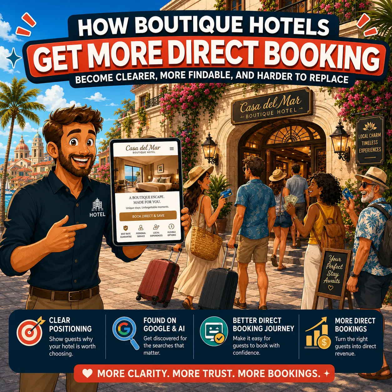
The Goal
Every recommendation in this case study traces back to one calculation. At the start of this project, roughly 60% of bookings were flowing through OTAs instead of the hotel’s own website. Which is commission paid away on every one of those reservations. A 5% shift from OTA to direct bookings was set as a realistic, not aspirational, 12-month target, based on the hotel’s actual booking mix and commission rates.
of bookings via OTA channels
target shift to direct, in 12 months
projected annual commission savings
Starting Point
This wasn’t a hotel that needed saving. Occupancy was already north of 85%. The location is central in Vienna, the design is modern and distinctly boutique, the spa and fitness offering is genuinely good, the rooms are well finished, breakfast is a real selling point, and the kitchen has earned outside recognition. The existing website was well designed too, its visual identity wasn’t the problem, and it wasn’t touched in this process.
The problem showed up the moment you tested how guests actually search. Nearby landmarks, business travelers, “hotel with gym,” “hotel with breakfast”, where the hotel barely appeared, on Google or in AI tools. And once a guest did land on the site, the path to booking existed, but it wasn’t clear or prominent enough to compete with how simple OTAs make that same decision.
✓ 85%+ occupancy, already close to fully booked
✓ Central, well-connected Vienna location
✓ Distinctive, modern boutique design
✓ A genuinely good spa and fitness offering
✓ High-quality breakfast program
✓ A creative kitchen with outside award recognition
✓ A well-designed website with a strong visual identity
✗ 60% of bookings still routed through OTA commission
✗ Barely visible on Google/AI for landmark, business-traveler, gym, and breakfast searches
✗ A booking path that existed but wasn’t prominent enough
✗ Rooms that were hard to compare side by side
✗ Trust signals (reviews, ratings) positioned low on the page
✗ Positioning expressed too poetically for Google, AI, or new guests to parse quickly
Assessment & Analysis
Before changing anything, every page was checked against how a guest actually decides, and against how Google and AI tools actually evaluate a hotel website. That produced 37 specific, written-down findings across four categories.
None of this is about the hotel being bad at marketing. Every one of these 37 findings falls into one of two buckets: guests can’t quickly do what they came to do, or Google and AI can’t quickly understand what they’re looking at. Both are fixable and neither requires touching the parts of the hotel, or the website, that were already working.
Steps
Of the 37 findings, five stood out as the levers with the biggest impact. They weren’t tackled in the order they were discovered, they were tackled in the order a hotel actually feels them.
The room section was positioned more prominently on the homepage leading to a room comparison, where guests could easily compare rooms by size, bed type, who it suits, and price sit side by side, closer to how they are used to compare on OTA sites.
Why first: this sits directly inside the booking decision. The faster a guest understands the difference between two rooms, the more likely they book direct instead of bouncing to an OTA to compare.
The CTA and booking path were made more prominent and easier to act on without searching for it.
Why second: every guest who already wants to book just needs an unblocked path to availability. It’s one of the fastest-moving levers, guests either book more easily, or they don’t, and that shows up within weeks.
Structured data, mobile loading speed, and the booking pop-up’s effect on page speed were all addressed.
Why third: this work carries close to zero downside. Published research ties page speed directly to conversion, and the same pattern holds on the Google and AI side. A safe move while the funnel changes above start to take effect.
Page titles, the use of “boutique hotel,” location language, and sustainability messaging were all made more explicit and concrete.
Why fourth: once guests, Google, and AI instantly understand what kind of hotel this is, everything built afterward, room descriptions, new pages, AI recommendations, works harder.
Dedicated pages were mapped for the topics guests actually search for: parking, breakfast, gym and sauna, business travel, arrival, nearby landmarks.
Why fifth: this content captures demand currently going to OTAs or nowhere at all — but it only pays off once a guest can find the page and easily book from it, which is why the funnel and positioning came first.
Steps 3 through 5 are exactly the kind of work that improves how Google and AI see the website, but neither re-crawls nor re-evaluates a site instantly. That lag is also why the conversion funnel was prioritized first: it’s the one part of this list a hotel can feel within weeks, while the visibility gains from the rest play out over months.
What the hotel received
The hotel received a prioritized direct booking growth brief based on a 37-point manual audit of the website, booking path, content, technical setup, and visibility in Google and AI search. It showed what should be improved first, why it matters, and how each change can support more direct bookings. It can be directly used to brief partners for implementation.
The practical outcome is therefore a clear roadmap that the hotel can implement with its agency.
The project started with the business case. Based on the hotel’s booking mix, a 5% shift from OTA bookings to direct bookings could save more than €36,000 per year in commission costs.
Why this matters
Hotels do not need abstract website advice. They need to understand how website improvements can connect to revenue.
I reviewed the website manually across conversion funnel, SEO, AI visibility, content clarity, technical setup, and booking friction. This was based on a clear checklist on how guests actually search, compare, trust, and book hotels.
Why this matters
Most direct booking problems are hidden in small moments: unclear room choices, weak CTAs, missing trust signals, slow mobile pages, or unanswered guest questions.
The findings were sorted by impact. The first priority was the direct booking path. Then came technical improvements, clearer positioning, content opportunities, and visibility improvements.
Why this matters
Not every task has the same effect on direct bookings and revenue, a good prioritisation matters for the ROI of the hotel.
The brief showed how to make the booking path clearer, how to bring rooms closer to the decision point, and how to make room categories easier to compare. The focus was to make it easier to book.
Why this matters
When guests cannot easily compare rooms or find availability, they often return to an OTA to finish the decision.
The audit mapped where the hotel could become clearer for Google and AI tools. This included stronger boutique hotel positioning, clearer page titles, better location signals, more useful feature pages, structured data, and entity consistency.
Why this matters
Google and AI tools cannot confidently recommend a hotel if they cannot clearly understand what it is, where it is, who it is for, and why it is relevant.
The hotel received a map of important pages and sections to create or improve. This included rooms, breakfast, parking, arrival, gym, sauna, business travel, meeting rooms, and nearby landmark content.
Why this matters
Guests search for specific answers before booking. A hotel website should answer those questions directly, instead of letting OTAs or generic travel pages win that demand.
The recommendations were written as concrete implementation tasks the hotel can use with its agency. Each task explained what to change, why it matters, and which part of the direct booking journey it supports.
Why this matters
The value comes from action. It is important to me that the next step is as easy as possible so the hotel can do the implementation without too much friction. I’m also very happy to assist in this process.
The roadmap included checkpoints for 3 months, 6 months, and 12 months. The goal is to review conversion funnel behavior first, then technical and visibility improvements, and finally the direct booking shift against the original commercial target.
Why this matters
This is not a finished success story yet. The results need to be measured after implementation to see if we achieve the intended results.
Before & after examples
The audit did not stop at general advice. It translated findings into practical website improvements the hotel can implement with its agency. The goal was not to remove the hotel’s boutique personality. The goal was to keep the character, but add the clarity guests need before they book.
• The homepage had a strong brand voice and created a clear sense of personality, warmth, and atmosphere.
• The first screen did not explain the hotel’s category, location, main guest benefit, and booking path clearly enough.
• Important booking elements, especially rooms and prices, appeared too late in the page structure.
• Trust signals such as ratings, reviews, and guest proof were not visible early enough in the decision journey.
• The page included many strong elements, such as rooms, restaurant, neighborhood, partners, art, and brand story, but the order made the booking decision harder than necessary.
• Make the first screen immediately explain what the hotel is, where it is, and why guests should stay there.
• Add a clear booking CTA and a secondary room CTA above the fold, such as “Check availability” and “View rooms and prices.”
• Move the room comparison much further up the homepage, so guests can start comparing categories earlier.
• Show room cards directly on the homepage with size, room type, key feature, price indication, and link to room details.
• Add independent review signals close to the top of the page, so guests see trust proof before they start doubting.
A homepage should not only express the brand. It should help guests understand the hotel, trust it, compare rooms, and move toward booking directly.
• The room overview used stylish room names and brand language, which fit the boutique character of the hotel.
• Guests could see room categories, size ranges, short descriptions, and starting prices.
• The most important comparison details were not structured consistently across all room categories.
• Guests had to work too hard to understand the practical differences between rooms.
• The page did not make it clear enough which room was best for couples, business travelers, longer stays, guests wanting a balcony, or guests wanting a quiet room.
• Turn the room overview into a clearer comparison page, not only a visual room gallery.
• Add room cards that show the most important decision details at a glance: size, bed type, layout, view, balcony, workspace, and price indication.
• Add “best suited for” labels, so guests quickly understand which room fits their stay.
• Add feature labels such as balcony, quiet bedroom, city view, living area, workspace, bathtub, or compact room.
• Keep the creative room names, but pair them with clear descriptive labels that guests, Google, and AI tools can understand.
If guests cannot compare rooms clearly on the hotel website, they often return to an OTA to make the decision. A better room overview keeps more of that decision on the hotel’s own website.
• The page listed useful room facts such as size, bed type, furniture, amenities, and starting price.
• The description created a feeling of comfort, but did not fully explain the actual stay experience.
• Several important decision details were unclear, such as room layout, quietness, balcony, view, workspace, and bathroom setup.
• The page did not clearly explain who the room was best suited for, such as couples, business travelers, remote workers, or longer-stay guests.
• Common guest questions were not answered directly on the page, which could create uncertainty before booking.
• Turn the room page into a structured decision-support page with highlights, experience description, room details, practical notes, and FAQs.
• Explain the actual room layout clearly, including separate living and sleeping areas, bedroom orientation, balcony, workspace, and bathroom setup.
• Add specific decision details such as one king-size mattress, quiet sleeping area, two workspaces, strong WiFi, air conditioning, balcony, and view.
• Add “best suited for” and “not ideal for” sections, so guests can self-select before booking.
• Add a room FAQ answering practical booking questions, such as whether the bed is one mattress, whether the bedroom is quiet, whether two people can work there, and whether the room is suitable for families.
Every unanswered room question can become a reason not to book. A clearer room page reduces uncertainty, supports direct bookings, and gives Google and AI tools much better information to understand the room. Below you see some examples of improvements for the structure and content of the website:
Result
It would be easy to round this up into a tidy growth story. It isn’t one, at least not yet. Real booking numbers will be reported at the checkpoints below, not before.
Next Steps
Booking path and room comparison are the fastest-moving lever. Expect the first measurable shift in booking engine behavior.
Search and AI visibility move slower than on-page conversion. Checkpoint for whether the foundation work is translating into rankings.
The original 5% shift and €36,000+ savings target, checked against real booking numbers.
I’ll show you 3 specific direct booking leaks your hotel can fix within one week. You will know what to improve first and whether a deeper website upgrade makes sense.
If you want to understand how this could work for your hotel, we can walk through your website together and identify where you’re currently losing bookings.
Read practical hotel website growth guides
I write about hotel SEO, AI search, direct bookings, website structure, room pages, breakfast pages, and the small content gaps that quietly send guests back to OTAs.

Navigate
Language
Contact
I’m based in Vienna, Austria. You can connect with me on LinkedIn or send a message through the contact section.

© Patrick Lindbichler 2026 | Legal Disclosure (Impressum)