Chapter 1: Most Hotel Websites Are Accidentally Sending Guests to Booking.com
I have reviewed hundreds of hotel websites. And I think 99% of them had at least one missed opportunity that makes guests more likely to book on Booking.com than directly. I am not even talking about price. Although price will also be a topic. More about that later. First let’s look at the booking funnel on your hotel website.
Here is what I actually saw when I put myself in a guest’s shoes and tried to book on hotel websites:
- I had to scroll down very far on the homepage just to find an option to book.
- I saw no sign of any other guest who had ever booked this hotel on their own website. No reviews, no ratings, nothing. Or sometimes it looked like the owner created some reviews (even though they were potentially real reviews).
- The room pages were somewhere near the bottom of the homepage, below several sections I did not need.Had to go through a lot of stuff before someone let me choose a room.
- Comparing rooms was a challenge in itself. I had to open every room page individually to find the details I needed. (Why do you like to hide the price so badly?)
- I selected a room, clicked “Check Availability,” chose my dates… and suddenly I had to find my room all over again. It had no idea what I had just picked. A persistence test, I guess, that the majority of hotels liked to present to me.
- I checked the room details, but had no idea what kind of bed I would get. Is there a balcony? What is the view? Is there even a photo of the bathroom?
- I wanted to book, but wait… what if I needed to cancel? There was either no information on cancellation at all, it was buried somewhere in the terms, or the policy was noticeably worse than Booking.com or the hotel next door.
None of these individual issues will stop a persistent guest from booking. But together they create friction. And friction kills bookings. Again, it doesn’t kill all bookings. But as someone who has seen conversion data for 8 years, I can tell you each friction point reduces the number of bookings by a couple of percent. SO when most hotels I speak to tell me the majority of their reservations still come through OTAs, this is a big part of why.
The good news: every single one of these problems is fixable. Most of them very easily. So you do not need to be a luxury brand with a six-figure web budget to fix them. You just need a bit of dedication and my 7-Touchpoint Framework in this article.
In this guide
- Why Hotel Website Conversion Optimization Is So Hard for Independent Hotels
- The 7-Touchpoint Hotel Booking Funnel: The Framework
- Deep Dive: Optimizing Each of the 7 Hotel Booking Funnel Touchpoints
- Practical Examples From Real Hotel Websites
- Hotel Booking Funnel Checklist: Is Your Website Ready to Convert?
- How the Booking Funnel Optimization Can Lead to Your Direct Booking Flywheel
- How This Article Fits Into the Bigger Hotel Website Strategy
- FAQs on the Hotel Booking Funnel
Key Highlights in this article
Before we dive in, here’s how an optimized booking funnel on your website helps you get more direct bookings.
✔ A booking option visible without scrolling is the most impactful change most hotel websites can make today. Guests expect it, and its absence immediately creates doubt.
✔ The “start over” problem and how to fix it → guests select a room, enter the booking engine, and lose all their choices. This is one of the most common and damaging conversion killers on hotel websites.
✔ Payment options are a direct conversion lever. Every additional payment method you add increases the likelihood of a booking. This is not a theory; it is one of the clearest patterns from years of OTA optimization data.
✔ Your entire website should function as a funnel, not just a brochure. Every page is either guiding a guest toward booking or losing them to a competitor.
✔ Clear touchpoints across your hotel website, increase the likelihood that guests book with each barrier you remove. I’ll share my framework here with you, which I call the 7-Touchpoint Hotel Booking Funnel.
Chapter 2: Why Hotel Website Conversion Optimization Is So Hard for Independent Hotels
The Structural Disadvantage Hotels Do Not Talk About Enough
Here is my honest confession: I have an unfair advantage when it comes to booking funnels, and I want to tell you exactly what it is.
For over 8 years, I was Head of SEO, AI, and Content at a major OTA, optimizing the booking funnel across more than 16,000 travel experiences. My job was to look at every element on every page. This included “small” elements like the button text, the headline of a product, the placement of a price, and the presence or absence of a cancellation note. With each test, we figured out what made people book or abandon. I watched millions of bookings happen, and much, much more not happen. I tested changes and saw in real data what moved the needle and what did not.
This kind of systematic, data-driven exposure to booking behavior is something an individual hotel simply cannot replicate. You simply don’t have enough data. Booking.com has spent two decades and hundreds of millions of euros perfecting their funnel. They know exactly what works. Most hotels, understandably, are focused on running a great property, not on A/B testing button colors.
But here is the thing: you do not need to test everything from scratch. The patterns are clear. And once you know what to look for, the fixes are very achievable. Let me tell you a story to show that even small hotels can make big steps.
A Story From a Family Hotel (That Did Not Go Exactly as Planned)
I grew up in a family hotel, and in my twenties I built our first website, including a proper booking funnel. It was well before the time I focused on how to optimise websites, but I was proud of it. It looked kind of stylish. Everything worked okay, so I put it live… and bookings started coming in. A lot of them, actually. I was even more proud.
There was just one problem: my father was still managing reservations in a completely separate system. The website had no idea what was already booked. He was often on the phone or answered e-mails and had no idea what was booked online. Within days, we had double-bookings stacking up and my father had to do some very uncomfortable phone calls. “Sorry your room, was already booked by a family, but if you are willing to share it, the family seemed really nice …”.
Unfortunately, we had to take the booking system offline while we sorted that little problem out. The lesson I took from that experience was not “online booking is risky.” It was rather the opposite: a good booking funnel is so powerful that even a small family hotel can be overwhelmed with demand. You just need to make sure your systems are ready for it.
Starting from that experience, I built a framework to optimise hotel websites for bookings. Using everything I learned at scale at the OTA, I analysed hundreds of hotels from a guest perspective to identify the friction points that stops guests from bookings. This became the foundation of the framework I am about to share with you.
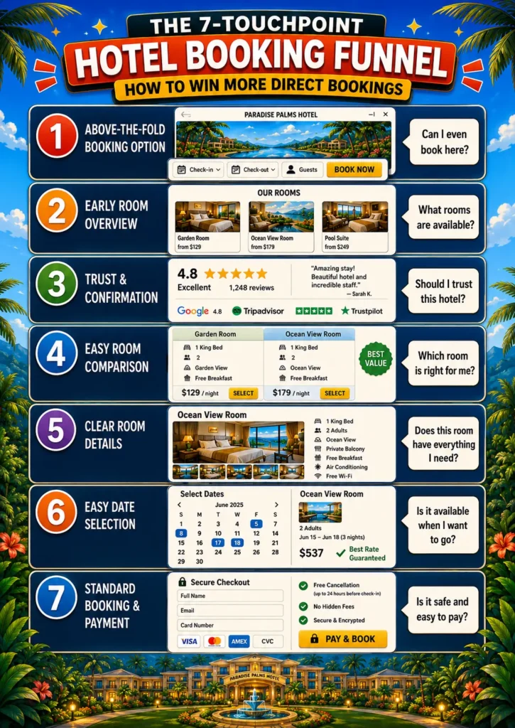
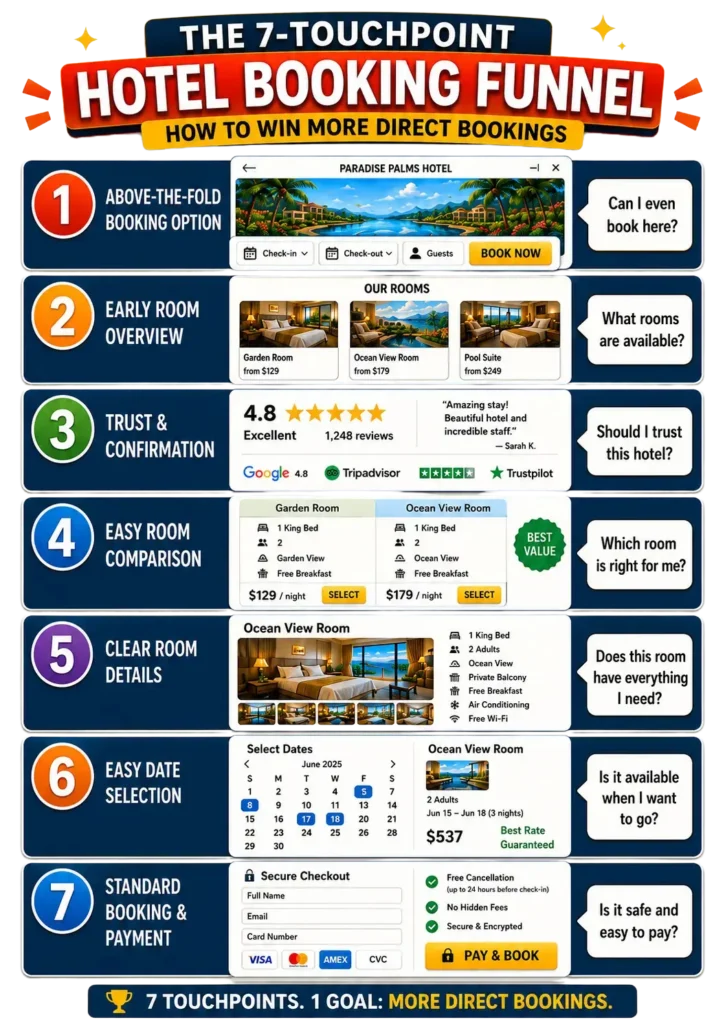
Chapter 3: The 7-Touchpoint Hotel Booking Funnel - The Framework
Think of the path from “hotel website visitor” to “confirmed guest” as a funnel with seven distinct moments. At each moment, the guest is making a small decision: do I keep going, or do I leave? Your job is to remove every unnecessary obstacle from the path of a guest who genuinely wants to stay with you.
Here is the framework at a glance:
Touchpoint | Where | Guest’s Question |
1. Above the Fold Booking Option | Homepage top | “Can I even book here?” |
2. Early Room Overview | Homepage scroll | “What rooms are available?” |
3. Trust & Confirmation | Homepage scroll | “Should I trust this hotel?” |
4. Easy Room Comparison | Rooms page | “Which room is right for me?” |
5. Clear Room Details | Individual room page | “Does this room have everything I need?” |
6. Easy Date Selection | Booking engine entry | “Is it available when I want to go?” |
7. Standard Booking & Payment | Checkout | “Is it safe and easy to pay?” |
Each of these touchpoints needs to work. Miss one, and you risk losing the guest entirely to Booking.com, to the hotel down the road, or just to the sofa and a Netflix series instead.
There is a concept Alex Hormozi talks about in his $100M Offers framework that applies perfectly here: every point of friction reduces the likelihood of a “yes.” He uses it in the context of sales offers, but it maps directly onto booking funnels. Every extra step, every missing piece of information, every moment of doubt → it chips away at the probability that a guest commits. The friction does not need to be big enough to stop someone cold. It just needs to accumulate.
This matches exactly what I saw working at the OTA. Every time we added clarity to a page, like making the title of the offer more specific, removing ambiguous information, and adding practical details, the percentage of people who completed a booking increased. Not always dramatically. But consistently. And across millions of sessions, even a half-percent improvement was worth significant revenue. For your hotel, the math is just as real. Remove a friction point, and more guests who genuinely want to stay with you will actually go through with it.
That is the spirit of this framework. Not to build a perfect website. But to remove every unnecessary obstacle from the path of a guest who is already interested. You’ll have a measurable impact on your direct bookings.
One important note: Test and measure the effects. Whenever you make changes on your website, make sure it has the intended results.
Chapter 4: Deep Dive - Optimizing Each of the 7 Hotel Booking Funnel Touchpoints
Touchpoint 1: Put a Booking Widget Above the Fold - The Potential Quick Win
People arrive on your homepage and they form an immediate impression. One of the first things a potential guest needs to see is confirmation of a simple fact: this is a hotel I can book directly. I don’t know how this works from a psychological perspective, but it gives guests a familiar feeling when they arrive on a hotel website and see that they can select dates and check room availability. That’s expected behavior.
What to do: Place a booking widget above the fold (that is, visible before scrolling), ideally right below your hero image or header gallery. This is the spot where guests usually expect it. At minimum, this should include arrival date, departure date, and a clear “Check Availability” button. You can optionally add number of guests, which helps surface relevant rooms immediately in the next step. Beyond the above-the-fold placement, also keep a booking option permanently visible in your header. This way, wherever a guest is on your website like reading about your spa, browsing your restaurant, they always have a one-click path back into the booking funnel.
The Mercure Sydney does this well. Before you read a single word of copy, there is a full booking widget with arrival, departure, adults, and children. You know immediately you are on a bookable hotel website. That clarity alone reduces friction.
The most common missed opportunity I see? No booking option above the fold at all. Guests scroll, get confused, and leave. More importantly, there is a share of guests that already made the decision to book with you. They search your hotel name and want to book as quickly as possible. Make it easy for them. Move them in your booking funnel.
Touchpoint 2: Show Your Rooms Early, Before Guests Have to Ask
When a guest starts scrolling your homepage, one of their primary questions is: what kind of rooms do you have? If they have to search for this information, you have already created unnecessary friction.
What to do: Include a room overview section early in your homepage. Ideally, one of the first sections after your hero area. This does not need to be exhaustive. A compact carousel or grid showing your room types, one key image per room, a brief headline, and a clear link to learn more is enough to orient the guest and move them forward. It should be sufficient to compare rooms and see the key elements of the room. Each room card should have two clear calls to action: one to view the full room details, and one linking to a complete rooms overview page for guests who want to compare everything side by side.
Think of this section as your storefront window. You are not trying to close the sale here. You are just showing guests what you have and inviting them to take a closer look.
Many hotels miss an opportunity by placing the room section very low on the homepage. Here is why this matters more than most hotel owners realize: industry data on scroll behavior consistently shows that homepage scroll depth sits at around 30–50%, meaning a significant share of visitors never make it past the halfway point of the page. On long, content-heavy homepages, that number drops further. If your room overview is buried below your history section, your sustainability statement, and three paragraphs about your restaurant, a large portion of guests will leave without ever seeing what rooms you actually offer. Put your rooms early. Make the choice to explore obvious. Every section you place above your room overview is one more reason for a guest to give up and open Booking.com instead.
Touchpoint 3: Give Guests a Reason to Trust You Before They Commit
Let us say a guest has scrolled past your rooms section and has not clicked anything yet. They are not necessarily uninterested, they are still deciding. The two main things holding them back at this point are: Is this hotel right for me? and Can I trust this website/hotel?
What to do: Address both directly. For trust, the most powerful thing you can add is real guest reviews, which are linked to a recognized platform like TripAdvisor, Google, or HolidayCheck, complete with star ratings and the platform’s logo. Guests need to see that the reviews come from somewhere they recognize and trust, not just a glowing testimonial that any hotel could have written themselves.
For the “is this the right hotel” question, make sure your homepage clearly communicates what makes your property distinctive. This can be your location, your amenities, the kind of experience guests can expect. I have a full guide on How to Structure a Hotel Homepage.
The most common mistake I see here is hotels either skipping reviews entirely or including review quotes with no platform attribution. An unattributed quote is almost worse than no review, because it makes skeptical guests even more skeptical. The real problem with missing reviews on your homepage is that guests might start looking somewhere else for them. And once they visit Google or Booking.com, chances they don’t come back to your website and book somewhere else or even someone else. Missed opportunity.
Touchpoint 4: Hotel Room Overview Page Best Practices - Show Key Features
When a guest reaches your rooms overview page, they have one job to do: figure out which room fits their needs. Your job is to make that as easy as possible.
What to do: For each room in your overview, show the following: at least one strong image, the price (yes, show the price, because hiding it is one of the most reliable ways to create doubt or it becomes a lot of effort to see if your hotel is within their price range. Anyway, it potentially results in guests navigating to OTAs where prices are visible immediately), the number and type of beds, the view, key features like balcony availability, bath or shower, and any standout amenities. Room size is a helpful addition if you have it.
The Hyatt Culver City’s room overview page is a strong example of clear room differentiation, because each option has a readable title, a description that highlights the key features, and an amenities summary. The one area where it falls short is that you still need to click through to see pricing. Do not make guests click through for pricing. It is the single most common reason a guest abandons a room comparison and heads to an OTA, where all the prices are visible in one view.
A room overview is a core page in your booking funnel. The majority of hotels miss the opportunity to make in easy for guests to compare your rooms. Put titles that are clear to differentiate, clear images of th room, the core features, and prices. Make it easy even on a small screen to go through the rooms quicky and pick the most suitable one. Otherwise it will always be more difficult to book on your website compared to Booking.com.
Touchpoint 5: Hotel Room Page Best Practices - Leave No Question Unanswered
A guest on your room detail page is close to a decision. The only thing standing between them and a booking is unanswered questions. Your room page needs to be comprehensive enough that no reasonable question goes unaddressed.
What to do: Cover the essentials like multiple high-quality photos including the bathroom, bedroom, and view; bed type and configuration; maximum occupancy; room size; all key amenities listed clearly; and any important policies specific to that room. Think about the questions your front desk gets asked repeatedly. Those are the questions your room page needs to answer.
NOX Hotels do this particularly well. Their room descriptions cover a high level of detail across multiple categories and match the kind of information you would find on Booking.com. That is the benchmark: if your website has the same quality of information as the OTA, there is no reason for the guest to leave. If your room page has less information, you are handing the booking to someone else.
For a complete guide to writing hotel room descriptions that convert, see this: How to Write Hotel Room Descriptions.
Touchpoint 6: The Hotel Booking Engine Handoff Problem… And How to Fix It
This is the touchpoint that, in my experience, most hotel websites get wrong, and it is the one that causes the most invisible damage to conversions.
Here is what happens: a guest browses your room pages, reads the descriptions, views the photos, and decides they like a particular room. They click “Book” or “Check Availability.” They enter your booking engine. And suddenly, they are looking at a blank date picker with no rooms selected, no memory of what they just chose, and sometimes a completely different set of room names that do not match what they saw on your website.
They have to start over. Many of them do not.
Why this happens: In most hotel website setups, the main website and the booking engine are two completely separate systems. Live data like availability and pricing, only exists inside the booking engine. The website has no way to pass the guest’s room selection into that environment. So the handoff is broken.
What to do: The ideal solution is a room page where guests can select dates and check availability, with their room preselected when they reach the booking engine. This is what Hotel Portugal in Lisbon (hotelportugal.com) has achieved: on each room page, guests can select dates, and when they proceed, the booking engine opens with that specific room already filtered and highlighted. It is not a perfect technical solution, but it makes the transition seamless enough that guests do not feel lost.
If a fully integrated solution is not possible with your current booking system, at minimum make sure your room names are identical on your website and in your booking engine. Inconsistent naming (e.g. “Superior Sea View Room” on the website, “Superior Room” in the booking engine) is confusing and creates confusion at exactly the wrong moment.
Touchpoint 7: Hotel Direct Booking Checkout Optimization - Remove Every Reason Not to Book
Your guest has selected a room. It is available on their preferred dates. They are ready to book. At this stage, your job is simple: get out of the way.
You almost had them go through the entire funnel and now they are one step away. What you want to do now is remove any remaining friction and any perceived risk. Here is how to handle the three things that matter most at checkout.
Cancellation policy. Be clear, be generous where you can, and put the policy where guests can actually see it (not buried in your terms and conditions). Offering a free cancellation window meaningfully increases the likelihood of booking, because it removes the perceived risk of committing. Even if it’s just 48 hours after booking free of charge it removes friction, because guests can still make adjustments without losing anything. The more flexibility you offer, the more comfortable a guest feels clicking that final button. Guests comparing your direct booking to Booking.com will immediately notice if your flexibility is worse and they will book there instead.
Payment options. This is one of the biggest conversion levers I encountered in years of OTA optimization. Every time a new payment method was added to the platform, conversion increased. The logic is simple: if a guest’s preferred or even only available payment method is not available, you have just given them a concrete reason not to finish. The most common options to cover are credit and debit cards, digital wallets like Apple Pay, Google Pay, and PayPal, Buy Now Pay Later solutions like Klarna or Affirm, and pay at arrival if your operations allow it. Each one you add removes a potential exit for a different type of guest. Keep in mind the conditions and fees attached to each, but do not let that be a reason to offer fewer options.
The steps themselves. Keep them minimal, logical, and boringly standard. What you actually need from a guest is: their contact details, and their payment. What they need from you is a confirmation page and e-mail. That is it. If you have additional questions for check-in purposes, ask for them after payment. You can even frame it as a service to the guest: something like “help us prepare for your arrival so check-in is faster.” Guests respond well to that framing because it feels convenient rather than burdensome. The more you can make the checkout feel like something they have done a hundred times before, the better. Familiarity reduces hesitation. Complexity and novelty create friction. And friction is one thing we learned in this article that we don’t want to have. Damn you, friction. Praise to clarity and simplicity.
Since we have completed the 7 touchpoints at this stage, let me address 3 more points:
First: Guests Do Not Go Through the Funnel in Order
As you have probably realized while reading through these seven touchpoints, guests do not always move step by step from homepage to confirmation. They jump around. They check the rooms first, then scroll back to read about the hotel. They open the booking engine to check availability, close it again, read a review, and come back an hour later. They gather information non-linearly and only commit when they feel ready.
Your job is not to force a sequence. Your job is to make clarity available at every point along the way and to remove friction wherever it exists. A guest who jumps directly to the room pages needs the same quality of information as a guest who arrived at the rooms section via the homepage. A guest who returns after reading reviews needs to find the booking path immediately, wherever they land.
Make the booking process logical, structured, and easy to do, regardless of the order a guest chooses to do it in.
Second: Why You Have All the Other Pages on Your Website
You may be wondering: if the booking funnel is these seven touchpoints, what is the point of everything else like the about page, the local area guide, the spa page, the restaurant page?
Two reasons.
First, they increase your chances of being found. Every additional page on your website is an additional opportunity to show up in a Google search or an AI recommendation. A guest searching “what to do near [your hotel]” might land on your local area guide first. That page does not need to close the booking, it just needs to exist, be useful, and have a clear path toward the booking funnel. Each page increases the surface area of your discovery.
Second, they support the decision. Most guests do not arrive on your website ready to book. They want to know what kind of hotel you are, what the experience will feel like, whether the location works for them. Your supporting pages give them the clarity to decide that yes, this is the right place. Once they have that confidence, they will find their way into the booking funnel.
What is key for all of these pages is that the path back into the booking funnel is always obvious and always easy. Ideally, every supporting page has:
- A sticky “Book Now” button in the header, visible at all times
- A section that shows your rooms and links directly to the room overview page
Do not make guests who are ready to book go hunting for the booking option on your restaurant page.
Third: The Recommended Length of Your Booking Funnel
Here is my recommendation for the ideal funnel structure:
Landing page → Room & Date Selection → Room Details → Personal Information → Payment → Booking Confirmation
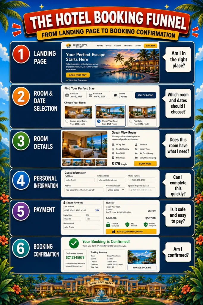
Six steps. I believe this is the right balance for two reasons.
First, each step does one clear job that is genuinely necessary in the decision and booking process. Nothing is redundant.
Second, it is the minimum number of steps you can have without removing something that matters. I have analyzed funnels for years, and one pattern is consistently and unmistakably true: you lose a meaningful share of people at every single step. Every click is a decision point. Every additional screen is another moment where a guest can change their mind, get distracted, or lose confidence.
This is why platforms like Amazon (which famously perfected the one-click checkout) and Booking.com spend enormous engineering resources trying to reduce the number of steps to as few as possible. The data is unambiguous. Every step costs you bookings.
Be ruthless about your funnel. Remove every piece of uncertainty. Remove every unnecessary question. Remove every step that does not earn its place. Because a guest who reaches your checkout already wants to stay with you, your job at that point is simply to get out of the way.
Want more practical hotel website ideas in your inbox?
In my newsletter, I share clear, actionable ideas for hotel owners and marketers who want more guests to find, trust, and book their hotel directly.
Chapter 5: Practical Examples From Real Hotel Websites 🔍
Let me show you five real examples from hotel websites that illustrate what each of these touchpoints looks like when it is done well and in one case, what guests are used to from OTAs that you should use as your benchmark.
Example 1 - Mercure Sydney: Booking Option Right at the Top
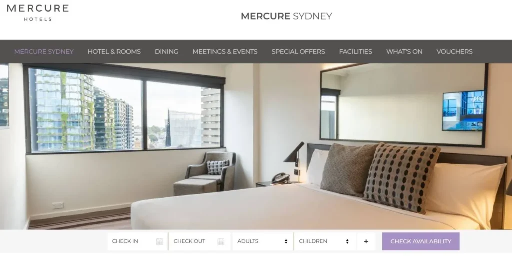
Website: www.mercuresydney.com.au/
Before I start reading a single word of copy, I already have a full booking widget in front of me: arrival date, departure date, number of adults, and number of children. I immediately know I am on a hotel website I can book directly. There is no scrolling, no hunting, no doubt.
This is exactly what Touchpoint 1 should look like. The booking option is not buried below a welcome message or a photo gallery (actually, it is below a photo gallery, but that’s fine ;)), it is the first functional element on the page. Clarity from the first second.
What to copy: Place your booking widget above the fold so it is the first thing a guest sees. Add arrival, departure, and guest count fields. Pair it with a sticky header option so guests can always get back into the booking funnel from any page on your site.
Example 2 - Hyatt Culver City: A Clear Room Overview That Works (Almost)
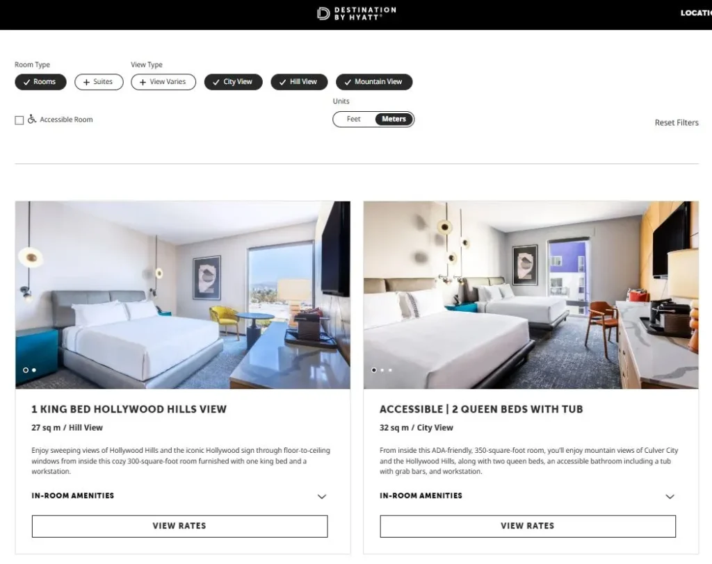
Website: www.hyatt.com/destination-by-hyatt/en-US/laxdi-the-shay/rooms
This is one of the cleaner room overview pages I have come across. The title and short description of each room make the main features immediately clear. Below each room, you can check the key amenities without having to click through. It is easy to scan, easy to compare, and easy to move forward from.
The one thing I would change: you still need to take an extra step to see the rates. That extra click is a missed opportunity. Guests who cannot see a price immediately will often head straight to Booking.com, where all prices are visible side by side. Do not make them ask.
What to copy: Show each room with a clear title, a short description, key features, and (critically!) a visible price. Give guests two calls to action per room: one to see the full room details, one to check availability. Make it feel like a decision they can make in one place, not a treasure hunt.
Example 3 - NOX Hotels: Room Descriptions That Compete With OTAs
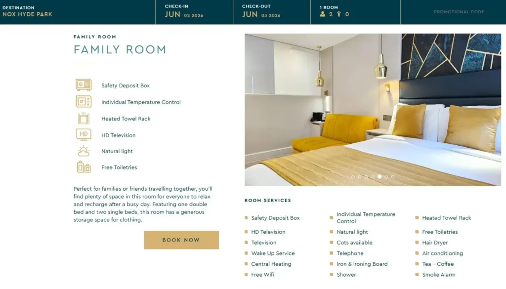
Website: www.noxhotels.co.uk/en/hotel-hyde-park-in-hyde-park-bayswater/accomodation/family-deluxe/
Clear and practical. NOX Hotels show you that you do not need to be an ultra-luxury brand to write room descriptions that work. What stands out:
- Their descriptions include a high level of detail across multiple categories
- They cover many of the same aspects you would find on Booking.co: bed type, amenities, bathroom, features
- The information is easy to scan and easy to understand
This is the benchmark: if your website has the same quality of information as the OTA listing, there is no reason for a guest to leave. If your room page has less information, you are handing the booking to someone else.
What to copy: Write your room descriptions as if you are competing directly with your own Booking.com listing. Cover everything a guest would want to know: bed type, bathroom, view, balcony, room size, maximum occupancy, amenities. Every unanswered question is a reason to close the tab.
Example 4 - Hotel Portugal, Lisbon: Date Selection That Follows the Guest
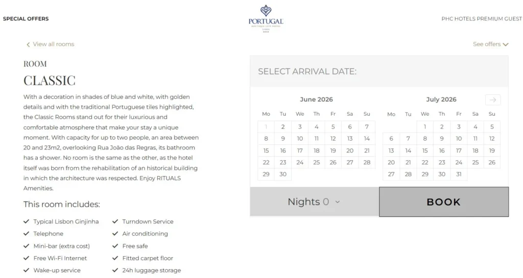
Website: www.hotelportugal.com/en/rooms-suites/classic-33601/
Hotel Portugal made a smart move with a simple solution. On each room page, guests can select their dates directly. When they proceed, they land in a booking engine with that specific room already filtered and highlighted. They do not have to start over. They do not have to find the room again. The transition is seamless.
It is not a perfect technical integration, but they made it work with what they have. And the result is a booking experience that respects the guest’s time and keeps the momentum going.
What to copy: If your setup allows it, enable date selection directly on room pages so guests enter the booking engine with their room pre-selected. If that is not technically possible, at the very minimum, make sure the room names on your website match the room names in your booking engine exactly. Inconsistency at this stage destroys trust at exactly the wrong moment.
Example 5 - Booking.com: The Benchmark You Should Study, Not Fear
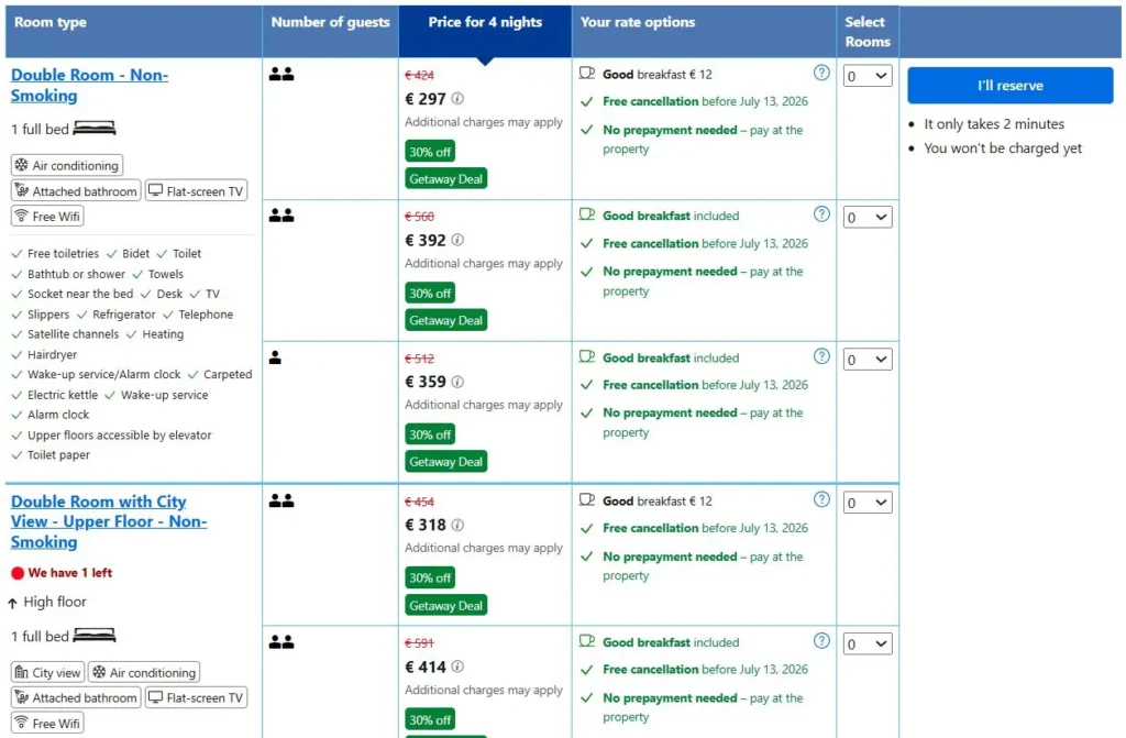
Website: www.booking.com/hotel/jp/apahoteru-dong-xin-su-ge-wu-ji-ting-tawa.html
I know, I know. But hear me out. Booking.com is not your competitor (just a more expensive channel). It is your reference point for what guests are used to. When a guest lands on a hotel listing there, they see everything in one view: the price, what is included, the cancellation options, the room features, detailed descriptions, and real reviews with scores. They can compare two room types side by side in seconds. And learn that in Tokyo, they promote Non-Smoking-Rooms.
This is the standard guests carry in their heads when they visit your website. Not because Booking.com is better than you, but because they have spent years perfecting the information experience around your rooms. Your job is to match that level of clarity and confidence on your own website. If you do, there is no reason for a guest to leave.
What to copy: Use your own Booking.com listing as a checklist for your website. Every piece of information a guest can find there should also be findable (ideally more easily) on your own room pages. If something is on the OTA that is not on your website, that is a gap worth fixing today.
Want more hotel website ideas and examples like this?
I regularly share practical thoughts on hotel SEO, AI search, direct bookings, website clarity, and how independent hotels can become easier to find and book directly.
Chapter 6 - Hotel Booking Funnel Checklist: Is Your Website Ready to Convert? ✅
The framework above covers a lot of ground. This checklist is how you turn it into action.
Go through your own website page by page and check each item off. You do not need to fix everything at once, but use this as a diagnostic tool first. Identify the two or three touchpoints where your funnel has the most friction, and start there. Even one improvement, made well, can have a measurable impact on your direct booking rate.
Touchpoint 1: Above the fold on homepage
☐ Booking widget visible without scrolling on the homepage
☐ Booking option also available in the sticky header
Touchpoint 2: Room overview on homepage
☐ Room overview section appears early on the homepage
☐ Each room has an image, a headline, and a CTA to view details
☐ A link to the full rooms page is included
Touchpoint 3: Trust signals
☐ Guest reviews are shown on the homepage
☐ Reviews include a star rating and a recognized platform (TripAdvisor, Google, etc.)
☐ Certificates or awards are displayed where relevant
Touchpoint 4: Room comparison
☐ Pricing is visible in the room overview (not hidden behind a click)
☐ Bed type, view, and key features are shown for each room
Touchpoint 5: Room details
☐ Room page includes multiple photos, including bathroom and view
☐ All key amenities are listed clearly
☐ No common question about the room goes unanswered
Touchpoint 6: Date selection
☐ Guests can select dates on the room page itself
☐ Room names match exactly between the website and the booking engine
☐ Entering the booking engine does not require guests to start from scratch
Touchpoint 7: Booking & payment
☐ Cancellation policy is clearly visible before checkout
☐ Multiple payment methods are offered (card, PayPal, Apple Pay, etc.)
☐ Checkout is no more than 4 steps from room selection to confirmation
Chapter 7: How the Booking Funnel Optimization Can Lead to Your Direct Booking Flywheel
Here is how I want you to think about all of this. Not as a checklist of things to fix once, but as a system that compounds over time.
Discovery → Booking → Great Experience → Review → More Discovery
It starts when a guest finds your hotel through Google, through AI, through a travel blog, or through a friend’s recommendation. They visit your website, which is a true booking engine: clear, confident, and easy to use. They book directly. They arrive. You deliver exactly what you promised or better. They leave a review. That review strengthens your positioning for the next guest searching the same thing. The flywheel turns.
This is why your hotel’s customer acquisition should not live entirely on rented land. OTAs are a tool, not a strategy. When you own the direct booking channel, you own the guest relationship. You can follow up. You can build loyalty. You can invest more in the experience because you are not paying 15–20% commission on every stay.
The goal is not to eliminate Booking.com from your channel mix. The goal is to make your own website a strong enough channel that OTAs become one part of a balanced strategy. That shift, even from 20% direct to 35–40% direct, can have a dramatic impact on annual profitability. Every percentage point of that shift goes straight to your bottom line.
That is the cycle I want you to build: consistently bring in guests through your own channel, give them more than they expected, and watch the system grow over time. It works. And the booking funnel you have just read about is where it starts.
Chapter 8: How this Article Fits Into the Bigger Hotel Website Strategy 🔗
Getting people to your hotel website is one challenge. Getting them to book once they arrive is another. Both matter, and they work together.
Think of it as a three-part system. First, search engines and AI tools match your hotel to the right guest searches. That is your visibility. Second, guests arrive on your website and find clear, detailed, trustworthy information. That is your credibility. Third, they can book quickly, confidently, and without friction. That is your conversion.
When all three parts work together, your website becomes a genuine growth engine. Guests who have a great booking experience arrive with positive expectations already set. And guests who have a seamless, professional direct booking experience are more likely to return directly next time, rather than defaulting to an OTA.
A great website experience is not separate from hospitality. It is the beginning of it.
For more on how to get found in the first place (=visibility), including SEO strategies and how to appear in AI search results, see:
For the full picture on reducing OTA dependency and building your website as your primary booking channel:
And for structuring your website and homepage effectively for higher conversion:
Conclusion: Your Hotel Website can drive bookings
The gap between a hotel website that converts and one that quietly sends guests to Booking.com usually comes down to the same seven moments. Most hotels are not losing guests because of price. They are losing them because something along the path created doubt, confusion, or just too much effort.
The 7-Touchpoint Booking Funnel is a practical framework, not a theoretical one. It comes from years of watching real people make real booking decisions at scale and from the humbling early lesson of watching a small family hotel’s booking funnel work almost too well.
You do not need to fix everything at once. Start with what is most broken. Even one improvement like adding a booking widget above the fold, showing prices in your room overview, or clarifying your cancellation policy can make a meaningful difference. Step-by-step, remove all the friction on your website and test the outcome.
And if you want help working through it, or have questions about how any of this applies to your specific website, feel free to reach out. That is what this is all for.
If you found this helpful and want more ideas like this:
👉 Follow me on Substack for deep-dive guides on hotel SEO, AI, and direct bookings
👉 Connect on LinkedIn for shorter insights and real-world examples
Want to improve more than just this one page?
This guide focuses on one specific part of your hotel website. But direct booking growth usually comes from improving the full system: your positioning, homepage, room pages, feature pages, Google visibility, AI search readiness, and booking journey.
FAQs on the Hotel Booking Funnel
1. Why do most hotel guests book on Booking.com instead of the hotel's own website?
The most common reasons are about price, trust and convenience. OTAs have spent years optimizing their booking experience so that finding, comparing, and paying for a room is fast and frictionless. Many hotel websites make this process harder: the booking option is hard to find, room information is incomplete, payment options are limited, or the cancellation policy is unclear. Guests default to platforms they already trust and know how to use. The good news is that every one of these friction points is fixable.
2. What is the most important change a hotel website can make to increase direct bookings?
If I had to pick one: make a booking option visible immediately on the homepage, without scrolling. It’s simple and it addresses the most fundamental question a visiting guest has (“can I actually book here?”) within seconds of arriving. Everything else builds from there.
3. How many steps should a hotel booking funnel have?
The ideal funnel is: Landing Page → Room & Date Selection → Room Details → Personal Information → Payment → Booking Confirmation. That is six steps, each with a clear purpose. The goal is to remove every unnecessary step while keeping everything a guest genuinely needs to make a confident booking decision. Every additional step you add loses a portion of guests, this is well established from large-scale booking data.
4. How much does adding more payment options actually matter?
Significantly. At the OTA where I worked, every time a new payment method was added, conversion increased. The reason is straightforward: if a guest’s preferred payment method is not available, you have given them a concrete reason to abandon the booking. Mobile bookings in particular benefit from Apple Pay and Google Pay, which remove several manual steps from checkout entirely.
5. What should I do if my booking engine and website are separate systems and I cannot sync them?
This is very common because most hotel websites run on a CMS, while the booking engine is a separate third-party tool. The most important things you can do in this situation are: ensure room names are identical on both the website and in the booking engine (inconsistencies destroy trust at the worst possible moment), allow date selection on your room pages where possible so guests enter the booking engine with context already established, and make the transition as smooth as possible visually. It is not a perfect solution, but it is meaningfully better than the “start over” experience many guests currently face.
The Prompt used To Create this article
I want to be transparent on how this article was written, so below you will find the prompt to create this article. Of course, I made and asked for adjustments afterwards, but here is the initial input:
Check the prompt
Before writing the full article, first give me the strongest angle, SEO and AI search focus, what you would expand, where you would need more unique insights. Wait for my input before writing the full article.
Can you create a compelling blog article for my website, www.patricklindbichler.com? Below you have my input for the article and the structure. Please keep all my ideas and build on them to make the article clear and easy to understand for the target audience. The audience are hotel owners or people working with hotel websites.
The main goal is to great an article with unique insights that can be applied to hotel websites. It should therefore provide value to readers and AI tools. Ask me additional questions if unique insights are lacking or could be strengthened.
The article should be clear and easy to understand, especially for people who are new to the topic. It should be written in good American English, using not too complicated words so that even non-native English speakers can follow along easily. It should show my experience being Head of SEO, AI and Content for more than 8 years at an OTA, managing more than 16 000 offers focusing on conversion. Plus my background in growing up in a family hotel, as well as working at a hotel. Now I analysed hundreds of hotel websites to identify the winning strategies. You can also find them on my website.
I am an encouraging person with dry humour. The article should encourage hotels to make improvements on their website and wanting to learn more. It should convey a you-can-do-it attitude, just put some effort in.
Please follow the structure outlined below, and feel free to expand on the points with additional context to ensure that each paragraph presents clear arguments.
Structure of the article:
- Introduction or The Problem (Hook): Start with a paragraph that summarizes the topic and grabs attention. You can make a strong statement or ask a thought-provoking question that will be answered later in the article.
- Key Highlights (3-4 bullet points): Include a few short bullet points summarizing the key takeaways of the article. Each point should be 1-2 sentences long.
- Chapter overview: Create an overview of the following chapters
- Main Content: Break the main part of the text into several text parts, each with a heading optimized for SEO and AI search. Each text part can have 1-3 paragraphs with 5-20 sentences each, depending on how much content is needed to explain the point clearly and bring the argument across. The paragraphs should be easy to read and compelling. Here is a structure for the main content:
- Explain Why the Problem Exists
- The Framework / Solution
- Deep Dive into Each Element
- Practical Examples
- Quick Checklist
- Connect to the Bigger Strategy
- Internal Links (Very Important)
- Headlines: Please create clear headlines that are searchable, natural, useful as answer targets for AI
- Conclusion: Wrap up the article by summarizing the main points and inviting readers to reach out if they have any questions or want to learn more.
- FAQs: Include 5 frequently asked questions about the topic, with clear answers that add value to the reader.
Formatting:
- Use bold sparingly to highlight key strategic takeaways.
- Use subtle emojis only where they improve scanability.
- If you include practical tips, illustrate them with real-life examples to make the content relatable.
- Please make the article a minimum of 1800 words. Feel free to ask me if you need more input or add information and context where you feel it’s necessary to convey a message or provide more clarity.
- Don’t use —
- Avoid generic statements
Goals:
- Please optimise the article for SEO and AI search. Give recommendations for search terms to include and integrate them into the titles of the paragraphs and the beginning of the article
- Please make the article engaging so people are intrigued to read, but also enjoy reading.
- What readers learn in the article, should be easy to apply for them because everything is explained clearly and has examples
Please use the following input to create the article:
- The Problem (Hook)
I’ve looked at hundreds of hotel website. I think 99% of them had a missed opportunity that makes guests rather book on Booking.com.
I’m not even talking that the price was higher on their website. I saw things like:
- I had to scroll down very far on their homepage to find an option to book
- I saw no sign of any other guest who booked this hotel on their website
- The room pages were somewhere at the bottom of the homepage
- Comparing the rooms was a challenge in itself, I had to open every room page to see the details I needed to compare (Why do you like to hide the price so badly?)
- I selected a room, clicked on check availability, selected the dates and… All of a sudden I had to find my room again
- I checked the room details, but wait, what kind of bed do I get? Is there a balcony or not? What is the view? Do you have an image of the bathroom?
- I wanted to book, but wait… what if I have to cancel? There is either no info about it, it’s hidden somewhere in the terms or it’s much worse than booking.com or the hotel next door.
None of this has to scare a guest away, but each of them could and does.
- Explain Why the Problem Exists
I have one big advantage compared to your hotel: I worked at an OTA and optimised the booking funnel for 8 years. I’ve looked at all the elements, buttons, texts on elements, headlines of products, missing information, unclear information, pictures, colours of elements, … and all the details that could potentially decide if people book across 16 000 travel experiences. I’ve tested what changes of each elements had on the likelihood of people booking. And I’ve seen millions of people book and not book.
This is something you can’t replicate. That’s why I created this framework.
- The Framework / Solution
Summarise chapter 4 in a clear framework that hotel owners can understand immediately.
It should be a framework to smartly create and optimise the 7 booking touchpoints for hotels to increase the likelihood of a booking.
- Deep Dive into Each Element
Touchpoint 1: Top of your homepage (above the fold)
People arrive on your homepage, that’s the first touchpoint to bring them in the funnel.
What I recommend for hotels:
- Have a booking option in the header that is always accessible → this way people can navigate to the booking funnel from everywhere on the website.
- And key for this section, put a booking option above the fold, usually right below the first image or gallery of your homepage. Since you are a hotel, let guests select an arrival and departure date. People expect this even from a hotel website at this point. Plus it confirms that they are actually on a hotel website that they can book. Optionally you can test to have them also select the number of travelers to provide them with suitable rooms already in the next step.
The most common missed opportunity of hotel websites that I’ve seen across the websites that didn’t perform so well, was to not have a booking option there.
Touchpoint 2: Room page overview on your homepage
When people scroll down on your homepage, one of the first sections that should appear, should be your room overview. Ideally this is a compact section, where people can see what kind of rooms you have available and quickly crasp their differences. This could be a carousel, where they can scroll through for instance.
Most important, there is a clear CTA:
- For each room to check the details of the room linking to a page that shows the complete details of your room
- After the whole section, a button that links to a page where people can get the complete overview of the rooms (if the selection on the homepage didn’t provide the necessary details for them to make a decision.
Touchpoint 3: Confirmation + Third party proof
We are still on your homepage, people did not pick any of the options to get further in the funnel. So what they still need to solve is to decide if your hotel has and is what they need or they don’t trust you. So here is how to address this:
- Trust: Provide proof. The simplest is to show review from other travellers. Ideally also linking and showing a trusted platform like TripAdvisor or Google with star rating and link to the actual reviews. In addition, you can show certificates. Create a dedicated sections plus put some elements on top of the page (e.g. certificates or ratings plus the logos from the companies people recognize like TripAdvisor, Google, HolidayCheck, … → pick known ones from your area that also your guests know)
- Is your hotel the right one? → show clearly what you offer. You can find out how to this on your homepage here: https://patricklindbichler.com/structure-a-hotel-homepage/
The most common missed opportunity I saw, is that hotels didn’t have any reviews on their homepage. And another share showed reviews, but no rating or platform where they got the review from. This commonly gives the feeling that does reviews are not 100% reliable and also don’t do the job for many potential guests.
Touchpoint 4: Room comparison
The next job your guests need to do, is to decide which rooms fit their needs. So you need to provide them with a clear overview of your rooms, so they can decide. What you should show for each room:
- Pictures or even a video
- Price
- Number and type of beds
- View
- Features like balcony/bathtub or shower/TV/…
- Optional the size
From their, link for each room to a page where they can see the full details of the room.
Touchpoint 5: Room details
The room details should leave no question open. Learn how to do that here: https://patricklindbichler.com/hotel-room-descriptions/
Touchpoint 6:Date selection
Admittedly, there are 2 styles of guests:
A: The ones who decide on the room first and then see if it’s available at the dates they’d like to travel
B: The ones who pick a date and then see if there is a suitable room
You will always have both, so you want to cater for both. So what you ideally have:
A: On each room, people should be able to check the availability
B: An option to select dates and see which rooms you have available. Ideally, you provide that at point 4 already.
The most common problem I see between point 4, 5 and 6 is:
Guests can browse through the website, they can chose rooms and get all the details about the room. Once they click on book, they need to select a date and… START ALL OVER AGAIN.
I quite commonly see this mismatch between the website and the booking system. Hotels often have a room comparison without date selection on their website and then again a room comparison with date selection in the booking system but with often less information. Sometimes even worse if the booking system uses different names for rooms as the website.
Touchpoint 7: Booking & Payment
You almost did it, your guests selected a room and it’s available at their preferred date. What you now want to do is to remove any potential friction and perceived risk with.
- A clear cancellation policy. Also one that allows the guest to cancel without costs after they made the booking (e.g. at least within the first 48 hours). The more flexibility you offer, the more you increase the likelihood people book
- Provide common payment options: This is one of the biggest conversion levers I’ve seen. The more payment options you provide, the more likely people book. Just keep in mind the condition for each payment. The most common ones are probably credit/debit cards, Digital Wallets: Apple Pay, Google Pay, and PayPal, Buy Now, Pay Later (BNPL): Solutions like Klarna, Affirm, and PayPal Credit and of course pay at arrival.
- Make the steps simple and quick to do, what you need is:
- Information from the guests: All the information you absolutely need like e-mail, name, … → ask the optional details after payment if you have a lot of requirements. I’ve seen many hotels phrase it as a service to make the checkin at the reception faster when you provide those details online
- Payment
- Confirmation + confirmation mail
I recommend to make this incredibly standard and simple.
Extra point 1:
As you probably realised, people don’t necessarily go through each step in order. They will jump around, gather information and process. You job is to increase clarity along the way and remove any friction. Make the booking process logical, structured and easy to do.
Extra point 2:
You may be wondering, if only the pages mentioned here are part of the booking funnel, what do I have all the other pages for? 2 reasons:
- They increase the chance of getting found online (e.g. on search engines and AI). Each additional page increases the chance people discover your hotel website
- They support the decision of the guest. Most of the guests won’t arrive on your website and start booking, they want to know what your hotel is about. They give them clarity if your hotel is the right choice.
What is key for all the additional pages, is to make it very easy to link back to the booking funnel. The ideal step you direct them too is the room and date selection page. What you ideally have is:
- A sticky button in the header
- A section on each page that shows the rooms and navigates to the room overview
Extra point 3:
My recommended length of the funnel is this:
Landing page → Room & Date selection → Room details → Personal information → Payment → Booking confirmation
I believe this is the perfect balance for 2 reasons:
- Each page does one clear job, that is necessary in the decision process
- It is the minimum amount of steps. I’ve analysed funnels for years and what is very obvious when you look at analytics: You lose a big share of people at every step. That’s why big platforms like Amazon (who perfected the one-click checkout) and Booking.com try to remove as many steps as possible.
Be very ruthless in optimising your booking funnel, remove every uncertainty and unnecessary friction.
- Practical Examples
Example – Mercure Hotel Sydney on Booking Option on the top of the homepage
https://www.mercuresydney.com.au/
Before I start reading, I already have a clear booking option with arrival, departure date, number of adults and kids. I see immediately I’m on a hotel website that I can book.
Example – Hyatt Culver City on Room overview
https://www.hyatt.com/destination-by-hyatt/en-US/laxdi-the-shay/rooms
One example that shows a clear room overview that is easy to understand. The title and description makes the main elements of the room clear, while you can also check out the amenities of each room. What I don’t like is that you need to check the rates in an additional step.
Example – Nox Hotel for Hotel room descriptions
Clear and practical: A well-structured description that competes with booking platforms by making key information easy to scan and understand. NOX Hotels show that you don’t need to be ultra-luxury to do this well.
You can see it here: https://www.noxhotels.co.uk/en/hotel-hyde-park-in-hyde-park-bayswater/accomodation/family-deluxe/
What stands out:
- Their descriptions include a high level of detail across categories
- They cover many of the same aspects you would find on Booking.com
Takeaway: If your website has the same (or better) information than OTAs, you keep the booking.
Example – Hotel Portugal on selecting dates in room details
https://www.hotelportugal.com/en/rooms-suites/classic-33601/
The Hotel Portugal in Lisbon made a smart move using a standardised booking system without much friction. In the room page you can select the dates, and then you get to another page where the room is prefiltered and you can check the availabilities. Not the perfect solution, but they made it work with what they have.
Check examples here: https://chatgpt.com/c/6a1daa8e-cdac-83eb-96ae-d5a01cd38fae
Example – Booking.com showing the simplicity of choosing a room
https://www.booking.com/hotel/it/amalfi-luxury-house.html
I’m sorry for including Booking.com, but it shows clearly why people like booking there so much. See here that you have all the critical information in one place. The rates, what is included, features of the room, cancellation options and very detailed information about the room. They have been perfecting it for years, so why not take it as a rolemodel.
- Quick Checklist
Based on chapter 4, you can provide an easy checklist if their hotel website has all the elements proposed with a few checklist elements for each touchpoint.
- Connect to the Bigger Strategy
In the articles about SEO and AI search, I wrote a lot about on how to get users to find your hotel website. This article is about getting them to book, which is the key element of your strategy.
Providing a great experience on your website, in turn is promotion for your website. It is an integral part of the overall experience.
First it’s easy to find your website. Search engines and AI can match your hotel to exactly the right searches by guests.
Second, people find clear information on your website
Third, booking is made very easy. All questions are answered in the process and people can book with a good and positive feeling. The perfect preparation for their stay. Now you just need to meet their expectations during the stay and you built yourself a growth engine.
Here is a further read to move from OTA dependency to position your website as the main booking channel: https://patricklindbichler.com/how-hotels-reduce-dependency-on-booking-and-expedia/
- Internal Links (Very Important)
Articles on how to get found:
- https://patricklindbichler.com/hotel-seo-how-hotels-get-more-direct-bookings-from-google-chatgpt/
- https://patricklindbichler.com/ai-search-for-hotels/
On how to structure your homepage and website:
- https://patricklindbichler.com/structure-a-hotel-homepage/
- https://patricklindbichler.com/hotel-website-structure/
And additional articles to make the booking easy:
Have a question or want to share what’s working for your hotel? Drop a comment or reach out directly — I’d love to hear from you. 😊
If you’re a hotel owner and tired of being invisible for the searches that matter, click below and see how I can help you turn your website into a clear, high-converting booking engine.